Formatting Articles: Difference between revisions
Dgreenwood (talk | contribs) No edit summary |
Dgreenwood (talk | contribs) |
||
| Line 715: | Line 715: | ||
</tab> | </tab> | ||
</tabs> | </tabs> | ||
=== Single Tab Containers === | |||
You may also find single tab containers useful. Instead of multiple clickable tabs, you will render a single container, which you can collapse by clicking the tab heading. The heading will read "Hide contents" unless otherwise styled. | |||
<pre> | |||
<tab> | |||
Tab text goes here | |||
</tab> | |||
</pre> | |||
<tab> | |||
Tab text goes here | |||
</tab> | |||
You can also render the container collapsed, enabling the user to expand the text by clicking on the container. This is done with the "collapsed" tag. | |||
<pre> | |||
<tab collapsed name="Click Me"> | |||
You clicked me! | |||
</tab> | |||
</pre> | |||
<tab collapsed name="Click Me"> | |||
You clicked me! | |||
</tab> | |||
[[Category:Style Guide]] | [[Category:Style Guide]] | ||
Revision as of 15:27, 17 August 2020
The following article will give you guidance on writing articles in the Grooper Wiki.
Creating a New Article
2) If the article does not exist, you will see a message reading "Create the page "Article Name" on this wiki!" above the search results. Click the searched article's name in quotes to create it.
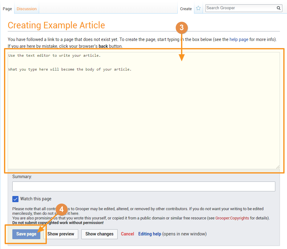
3) Use the text editor box to write your article. For more information on Mediawiki's markup formatting refer to the Writing Articles#Text Formatting - Markup Syntax section of this article.
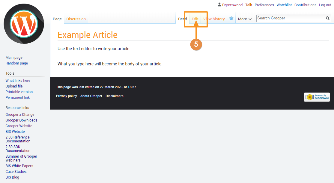
4) Press the "Save Page" button at the bottom of the text editor to save the page.
Text Formatting - Markup Syntax
Your article's text can be formatting using MediaWiki's markup. This is a syntax consisting of special characters, like asterisks, apostrophes and equals signs to do special things. For example, you can place a word in italics by placing a pair of apostrophies on both sides of the word, like ''this''.
Character Formatting
This is also referred to as "inline" formatting.
| Format | You Type | You Get |
| Italics | ''This is italic text'' |
This is italic text |
| Bold Text | '''This is bold text''' |
This is bold text |
| Bold and Italics | '''''This is bold and italic text''''' |
This is bold and italic text |
| Escape wiki markup | <nowiki>Don't use '''markup''' syntax</nowiki> |
Don't use '''markup''' syntax |
Sections
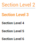
Section headers are useful to break up sections of information in your article. Sections and subsections are called out by pairs of equals signs on both sides of the sections name.
| You Type | You Get |
== Section Level 2 == === Section Level 3 === ==== Section Level 4 ==== ===== Section Level 5 ===== ====== Section Level 6 ====== |
Further Guidance
DO NOT use the "Level 1" section by typing a single equals sign on either side of the section name.
- For example:
= Level 1 =- Don't do this! This is bad.
Level 1 is reserved for the page level for the article you are editing. Begin all subsections at Level 2
- For example:
== Level 2 ==- Do this. This is good.
Do not type text on the same line of the section name. It will break the section.
| You Type | You Get |
== Section Name == Section info |
== Section Name == Section info |
== Section Name == Section info |
Bullets and Indents
Bulleted lists can be created using the asterisk *.
| You Type | You Get |
Normal line of text. * First bullet * Second bullet * Third bullet ** First sub-bullet ** Second sub-bullet * Fourth bullet ** First sub-bullet *** First sub-sub bullet |
Normal line of text.
|
Numbered bulleted lists can be created using the pound sign #.
| You Type | You Get |
Normal line of text. # First bullet # Second bullet # Third bullet ## First sub-bullet ## Second sub-bullet # Fourth bullet ## First sub-bullet ### First sub-sub bullet |
Normal line of text.
|
Lines can be indented using the colon character :
| You Type | You Get |
Normal line of text. : First indented line : Second indented line : Third indented line :: First twice indented line :: Second twice indented line : Fourth indented line :: First twice indented line ::: First thrice indented line |
Normal line of text.
|
Bullets and indents can be mixed as well.
| You Type | You Get |
Normal line of text. # First numbered line # Second numbered line # Third numbered line #* Bullet under third numbered line #: Indent under third numbered line # Fourth numbered line ## Numbered bullet under fourth numbered line ##* First bullet under numbered bullet under the fourth numbered line |
Normal line of text.
|
Notice the leftmost character of each line is always a pound sign #. If you break this pattern, you will start a new sequence of numbers.
| You Type | You Get |
Normal line of text. # First numbered line # Second numbered line # Third numbered line #* Bullet under third numbered line * NEW SINGLE BULLET # New numbered sequence line. ## Numbered bullet under new numbered line ##* First bullet under numbered bullet under the new numbered line |
Normal line of text.
|
HTML Tags
Some HTML tags are allowed in MediaWiki.
| Format | You Type | You Get |
| Fixed Width Text |
Fixed width text is useful for calling out regular expressions, such as <code>[^\r\n\t\f]+</code>. |
Fixed width text is useful for calling out regular expressions, such as [^\r\n\t\f]+.
|
| Underlines | <u>This text is underlined.</u> |
This text is underlined. |
| Strike-through | I want to <s>strike-through</s> a word. |
I want to |
| Blockquotes | Text before <blockquote>Blockquote</blockquote> Text after |
Text before
Text after |
Adding Images
There are two parts to inserting images into an article.
- Uploading the file.
- Using markup syntax to insert the image into an article.
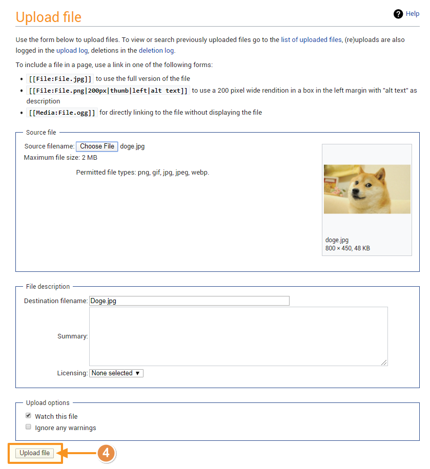
Uploading Images
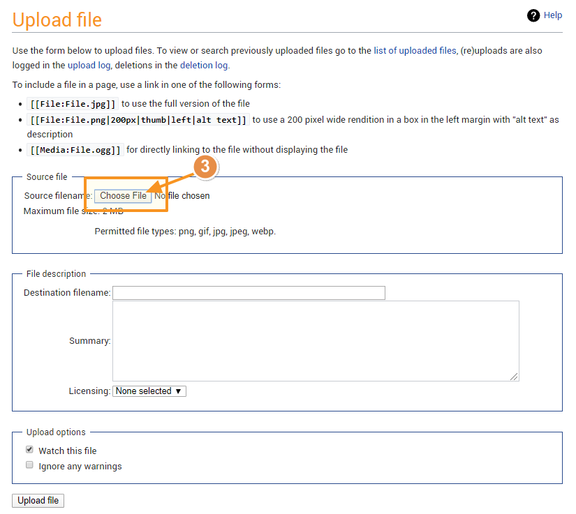
1) On any page, find the "Tools" section in the left hand tool-bar.
2) Press the "Upload File" button.
3) On the following page, press the "Choose File" button and choose the image you wish to upload from the file browser.
Adding the Image to an Article
The basic syntax for adding an image once it is uploaded is [[file:filename.extension]]
| You Type | You Get |
[[file:doge.jpg]] |
Options
There are several options you can add to further format the image. Options are called out within the square brackets after the filename and extension, separated by a vertical bar character |. A single image can be modified using multiple options, each separated by a vertical bar. The syntax is as follows:
[[file:filename.extension|Option1|Option2|Option3]]
Format Options
Size Options
Images can be reduced in size or enlarged, with some caveats.
- The Frame option may not be reduced or enlarged. It will ignore all size specifications
- The Thumb and Frameless options can be reduced, but not enlarged more than the original size.
Images can be resized using the following options (Original file size is 800 x 400 pixels).
Links
Internal Links
Links to articles within the wiki are called out with a double set of square brackets.
| Links | You Type | You Get |
| Link to the Example Article page. | [[Example Article]] |
Example Article |
| Link to an article, but display different text. | [[Example Article|This is an example]] |
This is an example |
| Characters after the brackets will be added to the hyperlink. | [[Example Article]]s |
Example Articles |
Avoid characters after brackets being added using the <nowiki /> tag |
[[Example Article]]<nowiki />s |
Example Articles |
| Link to a section in this article. | [[#Links]] |
#Links |
| Link to a section in another article. | [[Example Article#About]] |
Example Article#About |
| Using the pipe to change the links name is especially helpful for section linking. | [[Example Article#About|About]] |
About |
External Links
Links outside of this wiki can be "bare", or linked with no formatting. Or, they can be called out with a set of single square brackets to change the displayed text or show as a numbered annotation.
| Links | You Type | You Get |
| Bare link | https://www.grooper.com |
https://www.grooper.com |
| Annotation link | [https://www.grooper.com] |
[1] |
| Change the link's displayed text | [https://www.grooper.com Grooper] |
Grooper |
Tables - Basic Formatting
Table formatting can be confusing. But, tables can be powerful additions to your articles. This is a very quick introduction.
| Markup Character | Use |
{| |
Table start - Always required at the begining of the table |
|- |
Row start - Required to start a new row except for the first row. Wiki syntax always assumes the first row. |
| |
New cell - Use a single "|" for the first cell. Use a double "||" for each new cell or another single "|" if starting the cell on a new line (more on this later). |
|} |
Table end - Always required at the end of the table. |
If you want to create a table with three columns and three rows, the table would look as follows
{|
|Header 1||Header 2||Header 3
|-
|Row 1 - Cell 1||Row 1 - Cell 2||Row 1 - Cell 3
|-
|Row 2 - Cell 1||Row 2 - Cell 2||Row 2 - Cell 3
|-
|Row 3 - Cell 1||Row 3 - Cell 2||Row 3 - Cell 3
|}
This would render the following table
| Header 1 | Header 2 | Header 3 |
| Row 1 - Cell 1 | Row 1 - Cell 2 | Row 1 - Cell 3 |
| Row 2 - Cell 1 | Row 2 - Cell 2 | Row 2 - Cell 3 |
| Row 3 - Cell 1 | Row 3 - Cell 2 | Row 3 - Cell 3 |
You can also render the same table placing each cell on its own line in the editor. This is often necessary for tables with longer or more complicated text in a single cell. Note, only a single pipe is used to call out a new cell in this case.
{|
|Header 1||Header 2||Header 3
|-
|Row 1 - Cell 1
|Row 1 - Cell 2
|Row 1 - Cell 3
|-
|Row 2 - Cell 1
|Row 2 - Cell 2
|Row 2 - Cell 3
|-
|Row 3 - Cell 1
|Row 3 - Cell 2
|Row 3 - Cell 3
|}
And the same exact table is created, seen below.
| Header 1 | Header 2 | Header 3 |
| Row 1 - Cell 1 | Row 1 - Cell 2 | Row 1 - Cell 3 |
| Row 2 - Cell 1 | Row 2 - Cell 2 | Row 2 - Cell 3 |
| Row 3 - Cell 1 | Row 3 - Cell 2 | Row 3 - Cell 3 |
A great deal of styling and formatting can be done to tables. Refer to the MediaWiki's help page on tables here for more information.
Below are a couple examples of fancier formatted tables used in this wiki.
FYI Box
{|cellpadding="10" cellspacing="5"
|-style="background-color:#36b0a7; color:white"
|style="font-size:14pt"|'''FYI'''||Lorem ipsum dolor sit amet, consetetur sadipscing elitr, sed diam nonumy eirmod tempor inviduntut labore et dolore magna aliquyam erat, sed diam voluptua.

At vero eos et accusam et justo duo dolore set ea rebum. Stet clita kasd gubergren, no sea takimata sanctus est Lorem ipsum dolor sit amet.

* Lorem ipsum dolor sit amet
* consetetur sadipscing elitr
* sed diam nonumy eirmod tempor invidunt
|}
| FYI | Lorem ipsum dolor sit amet, consetetur sadipscing elitr, sed diam nonumy eirmod tempor inviduntut labore et dolore magna aliquyam erat, sed diam voluptua.
At vero eos et accusam et justo duo dolore set ea rebum. Stet clita kasd gubergren, no sea takimata sanctus est Lorem ipsum dolor sit amet.
|
Caution Box
{|cellpadding="10" cellspacing="5"
|-style="background-color:#f89420; color:white"
|style="font-size:14pt"|'''!'''||Lorem ipsum dolor sit amet, consetetur sadipscing elitr, sed diam nonumy eirmod tempor inviduntut labore et dolore magna aliquyam erat, sed diam voluptua.

At vero eos et accusam et justo duo dolore set ea rebum. Stet clita kasd gubergren, no sea takimata sanctus est Lorem ipsum dolor sit amet.

* Lorem ipsum dolor sit amet
* consetetur sadipscing elitr
* sed diam nonumy eirmod tempor invidunt

* Lorem ipsum dolor sit amet
* consetetur sadipscing elitr
* sed diam nonumy eirmod tempor invidunt
|}
| ! | Lorem ipsum dolor sit amet, consetetur sadipscing elitr, sed diam nonumy eirmod tempor inviduntut labore et dolore magna aliquyam erat, sed diam voluptua.
At vero eos et accusam et justo duo dolore set ea rebum. Stet clita kasd gubergren, no sea takimata sanctus est Lorem ipsum dolor sit amet.
|
Property Details
{|cellpadding=10 cellspacing=5 style="margin:auto"
|-style="background-color:#36B0A7; color:white"
|style="width:17%"|'''Property'''
|style="width:17%"|'''Default Value'''
|'''Information'''
|-style="background-color:#36B0A7; color:white"
|colspan=3|General Properties
|-style="background-color:#ddf5f5
|Property Name||Default Val||Info
|}
| Property | Default Value | Information |
| General Properties | ||
| Property Name | Default Val | Info |
Tabbed Containers
Tabbed containers can be very helpful for step by step "how to" instructions. Below is the markup for a simple tabbed container.
<tabs>
<tab name="Step 1">
Text for the first tab.
</tab>
<tab name="Step 2">
Text for the second tab.
</tab>
</tabs>
It produces the following result.
Text for the first tab.
Text for the second tab.
Each container must start with the <tabs> tag and end with the </tabs>
Each tab must start with the <tab> tag and end with the </tab> tag.
Text inside each tab is formatted just as you would a full page.
Tabs may be named using the name modifier, using the following syntax <tab name="Tab Name">
Tabbed containers may also be styled. One common styling is adjusting the margins. Here is the same tabbed container from earlier with the whole container indented 20 pixels on all sides.
<tabs style="margin:20px">
<tab name="Step 1">
Text for the first tab.
</tab>
<tab name="Step 2">
Text for the second tab.
</tab>
</tabs>
Text for the first tab.
Text for the second tab.
Here, we go one step further and indent the margins in each individual tab.
<tabs style="margin:20px">
<tab name="Step 1" style="margin:20px">
Text for the first tab.
</tab>
<tab name="Step 2" style="margin:20px">
Text for the second tab.
</tab>
</tabs>
Text for the first tab.
Text for the second tab.
Single Tab Containers
You may also find single tab containers useful. Instead of multiple clickable tabs, you will render a single container, which you can collapse by clicking the tab heading. The heading will read "Hide contents" unless otherwise styled.
<tab>
Tab text goes here
</tab>
Tab text goes here
You can also render the container collapsed, enabling the user to expand the text by clicking on the container. This is done with the "collapsed" tag.
<tab collapsed name="Click Me">
You clicked me!
</tab>
You clicked me!


