2023:CSS Data Viewer Styling: Difference between revisions
Dgreenwood (talk | contribs) |
Dgreenwood (talk | contribs) |
||
| Line 2,899: | Line 2,899: | ||
=== Generic Examples === | === Generic Examples === | ||
If you have not seen them already, | If you have not seen them already, click the link below to check out the Generic Layouts section of this article. If you're looking for simple, generic types of layout styles you will find some there. | ||
* [[#Generic Layouts|Generic Layouts]] | |||
=== Simple Invoice Model Examples === | === Simple Invoice Model Examples === | ||
Revision as of 08:47, 6 March 2023
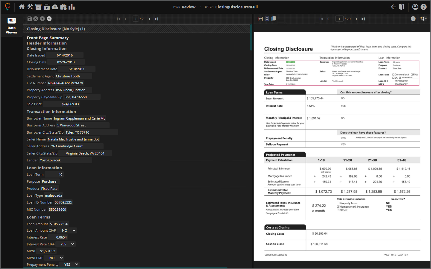
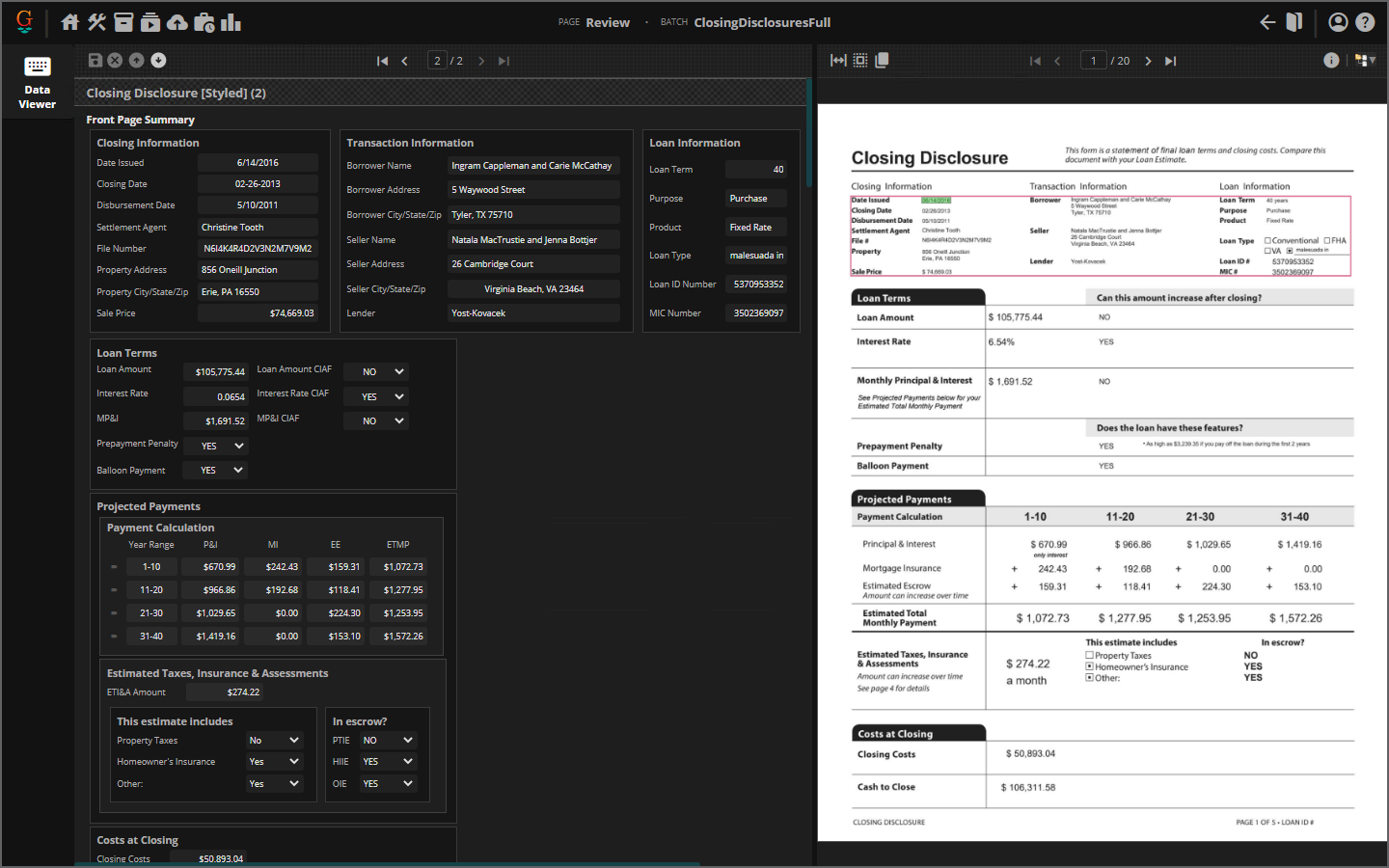
The Grooper Web client's Data View Review interface is styled using CSS (Cascading Style Sheets). This gives you a great deal of control over a Data Model's appearance and layout during document review.
About
CSS is a style sheet language used to define how HTML elements appear visually. CSS style sheets are ubiquitous in the world of web design and development. Fonts, headers and other container elements can be styled to make a web page more visually appealing and and easier to read. How this content is separated and presented on a web page can be formatted using a CSS file.
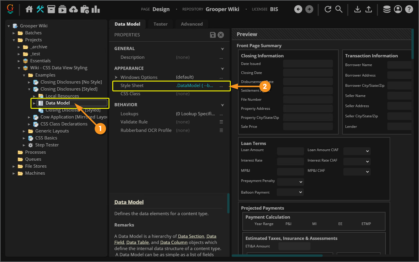
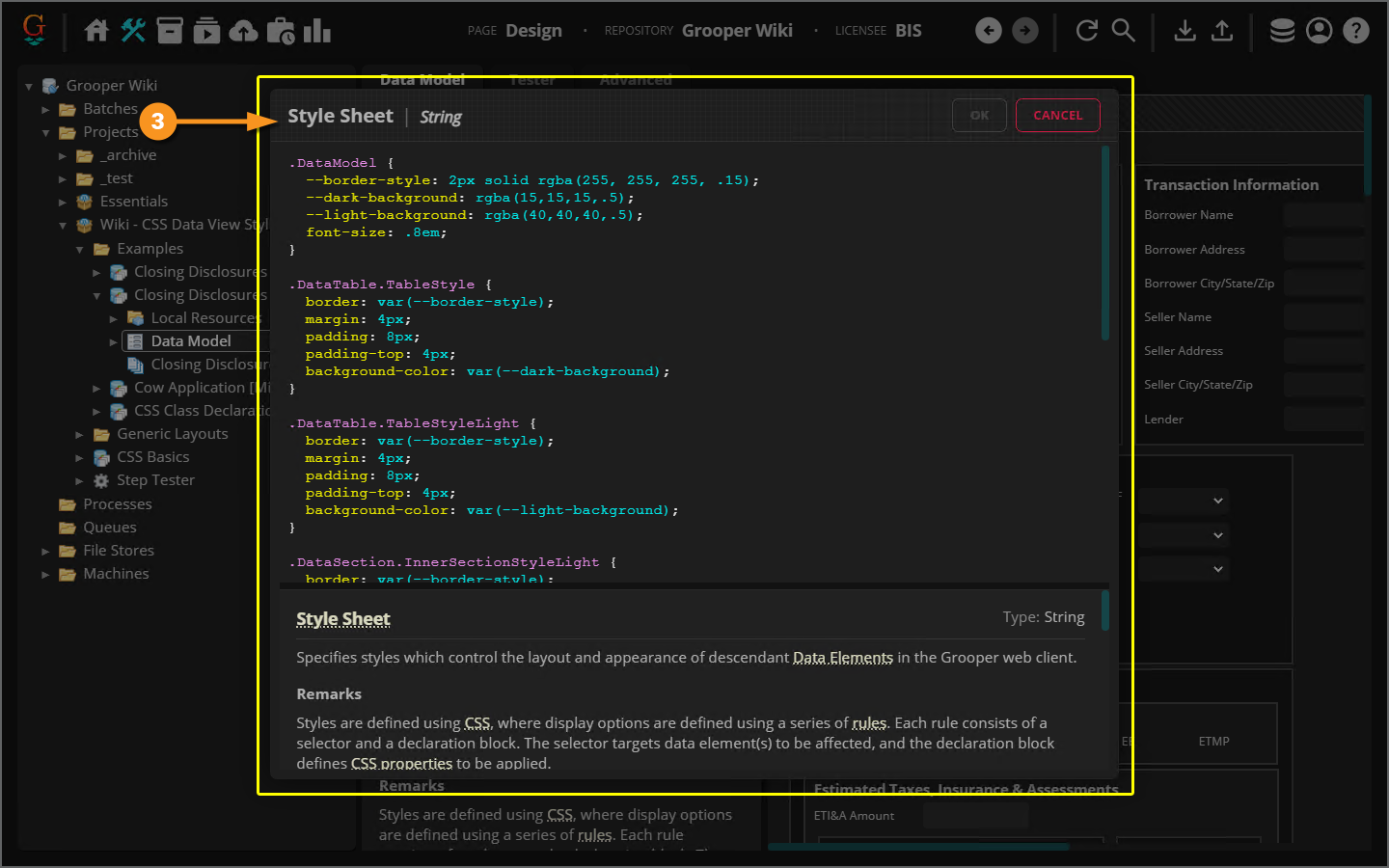
In Grooper, you can style your Data Model with custom CSS, changing how it appears during the Review activity (and previewed in the Design page). If you are using the Web Client, elements in your Data Model (Data Fields, Data Sections, etc.) are all rendered as some combination of HTML elements themselves when viewed over a browser. You can style how these elements are presented using CSS style sheets. This gives you a great deal of control over what you and your reviewers see in the Data Viewer during the Review activity.
| FYI |
The Review activity allows users to review various aspects of Grooper's automated document processing. What users review and how document content is presented is controlled by whichever Review Viewer UI the user is using.
|
|
|
|
|
|
|
|
Editing CSS at the Data Section and Data Table level can be particularly helpful when dealing with larger Data Models with multiple nested levels in their heirarchy. We will discuss this further in the Global Element Styling VS Local Element Styling section of this article. |
CSS Basics
CSS styles webpage elements by defining a series of rules. Each rule defines how an HTML element looks: its text's font, its colors, its margins on the page, its alignment with other elements and more.
In our case, the HTML elements we're working with correspond to our Data Model's Data Elements. The Data Fields, Data Sections, and Data Tables in the Data Model are rendered in a browser by a combination of HTML elements and their sub-elements. Each different kind of Data Element has a corresponding CSS class that can be custom styled.
|
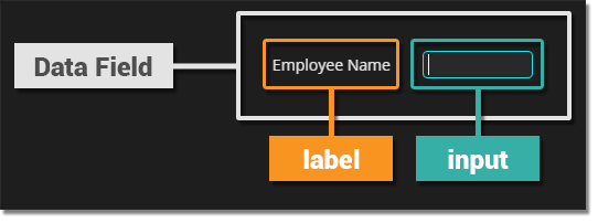
For example, when a user operates the Data Viewer in the Review activity and looks at a Data Field, they're really seeing three total HTML elements.
|
|
|
|
|
|
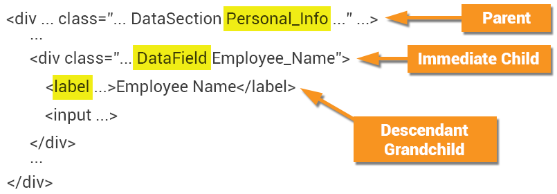
Remember, a Data Field is represented in HTML as an element with two child elements:
When styling Data Fields it's very important to understand which HTML element you want to style.
|
|
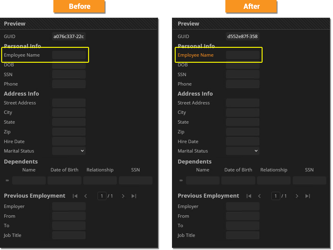
label {
  color: rgb(248,148,32);
  font-size: 18px;
}
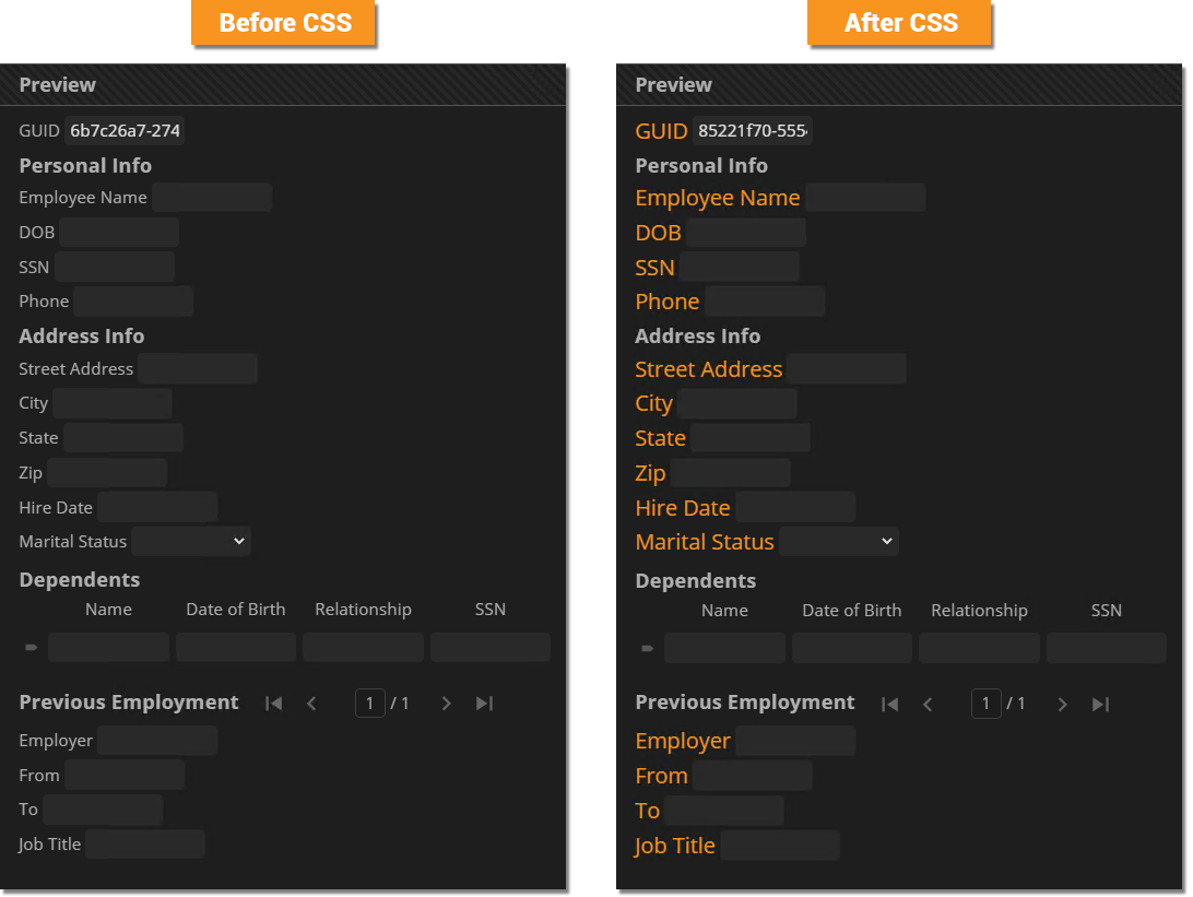
The selector
|
|||
|
No styling was applied to the:
We would need to make separate CSS rules, selecting these corresponding HTML elements to style them as we wish.
|
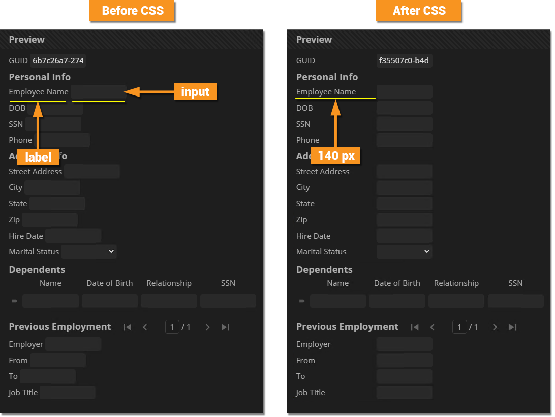
A Common Example: Increasing a Data Field's Label Width
|
label {
  width: 140px;
}
Now, the label widths for all Data Fields have been lengthened to 140 pixels. As a result, the Data Model is much easier to read and interact when operating the Data Viewer during a Review activity. |
Styling Scope: Selecting Data Elements
In the previous examples, we styled Data Field labels in a "global" manner. The CSS rule was applied to all Data Field labels in the Data Model. Sometimes we want to be more specific. We may want to narrow a rule's scope so that it is applied to some elements, but not others.
Narrowing down the styling scope is done using one (or both) of the following methods:
- Selecting a specific Data Element using it's name.
- For example, selecting and styling a Data Field named "Employee Name" rather than all Data Fields.
- Selecting a Data Element's children or sibling elements.
- For example, selecting and styling Data Fields in a Data Section rather than all Data Fields.
- This is done using what are called "combinators" in CSS.
Styling Named Elements
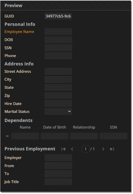
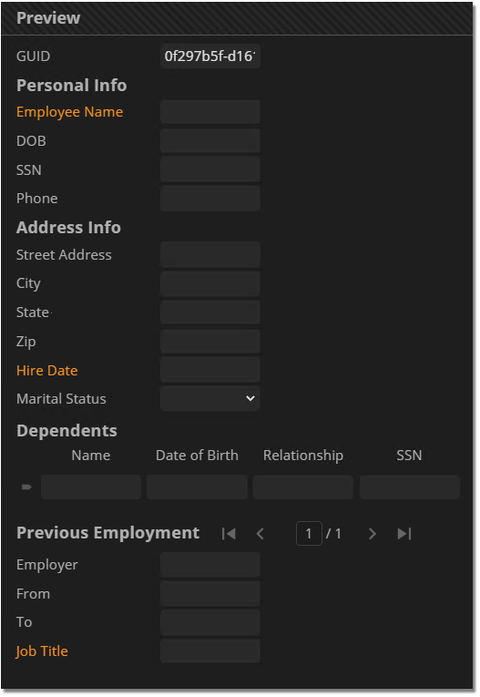
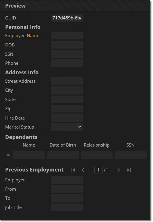
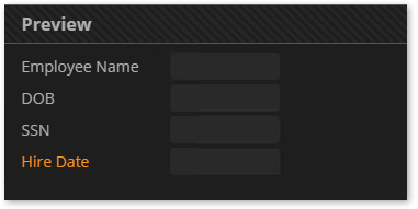
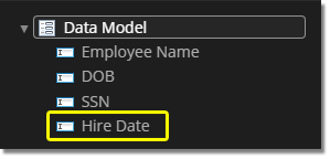
Imagine you have a specific Data Field you want to draw your users attention to. This may be a more "important" field according to some process if your organization that you really want them to pay attention to. One thing you could do is change the label's color to make it more distinct from the other fields in your Data Model.
To do this, you would select the specific element by name, rather than selecting all Data Fields.
|
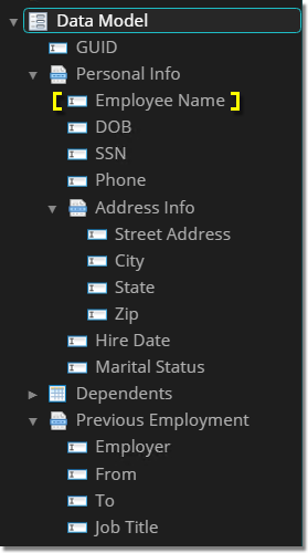
We're going to style just this Data Field with CSS. All we need to do is select the Data Field by name. Instead of using
.Employee_Name label {
  color: rgb(248,148,32);
}
|
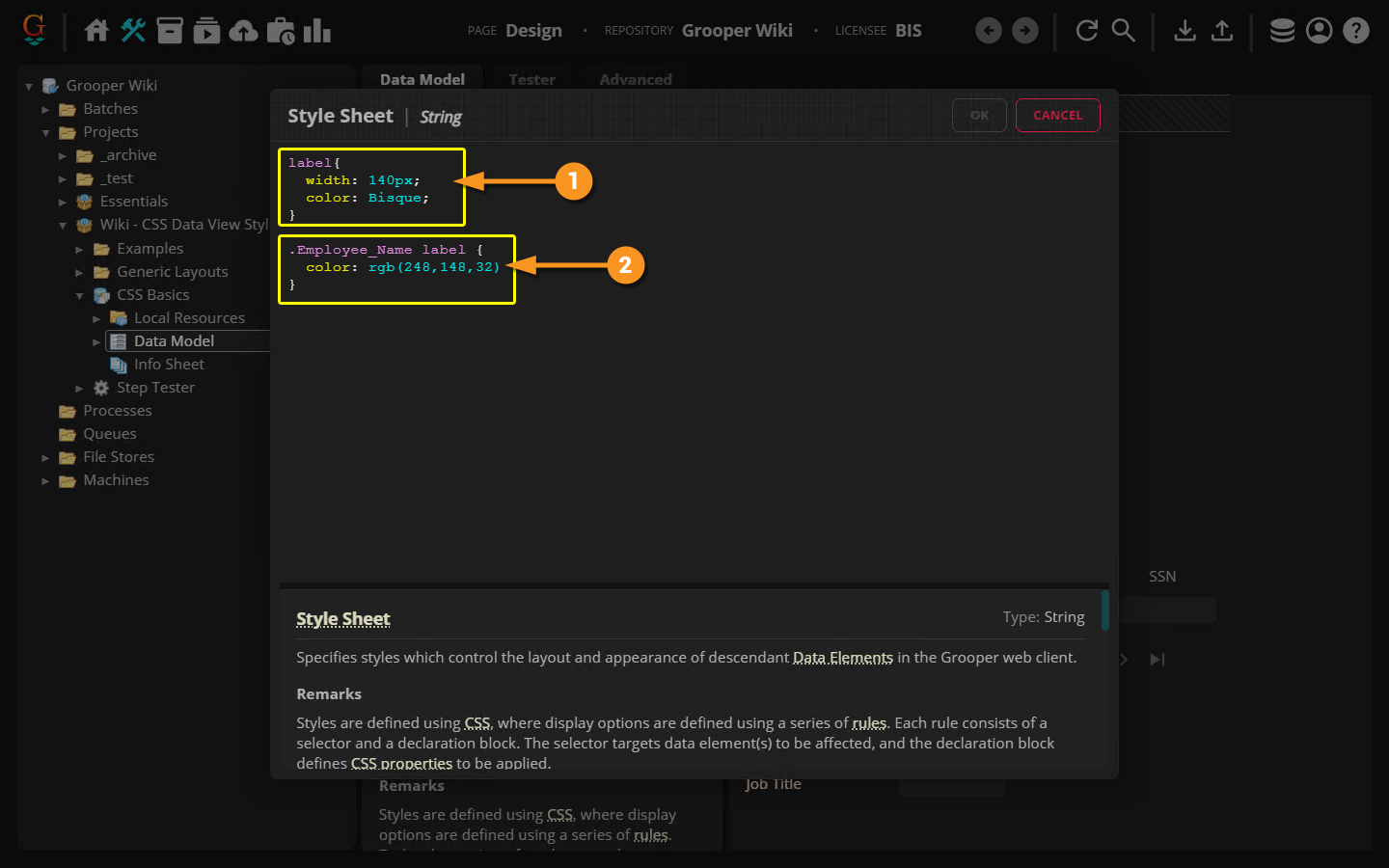
Selector Specificity
|
label {
  width: 140px;
  color: Bisque;
}
.Employee_Name label {
  color: rgb(248,148,32);
}
|
|
|
|
Selecting Multiple Elements
You can select and style multiple elements by creating a comma separated list of elements in the selector.
|
.Employee_Name label,
.Hire_Date label,
.Job_Title label {
  color: rgb(248,148,32);
}
|
Intro to Combinators
Styling child and sibling elements can be a great way to add more specificity to how you want to style various Data Elements in your Data Model. Child and sibling elements are selected in CSS using a "combinator".
A combinator explains the relationship between selectors. A combinator character is placed between selectors to define the relationship.
- i.e.
<element1><combinator><element2>
There are four combinators in CSS:
>- Immediate children selector+- Adjacent (meaning "first immediately following") sibling selector~- General (meaning "all following") sibling selector
|
|
Earlier, we styled the color of the "Employee Name" Data Field's label using the following CSS rule:
.Employee_Name label {
  color: rgb(248,148,32);
}
The space character between .Employee_Name and label is the "descendant children selector". By selecting .Employee_Name label, we were selecting the child label elements of the Employee_Name element (i.e. the Data Field HTML element with the Employee_Name class).
This means two things:
- Any styling we applied was done not to the parent
Employee_Nameelement (representing the whole "Employee Name" Data Field) but instead all descendant childrenlabelelements (representing the "Employee Name" Data Field's label). - The only
labelelements selected were children of theEmployee Nameelement. No otherlabelelements were styled that way.
Combinators, like the descendant children selector, give us a variety of ways to craft highly specific selectors, leading to highly specific rules for a subset of elements.
| FYI |
While technically |
Next, we'll look at other ways to use combinators.
Styling Child Elements
By far, the most common combinators you will likely use are the children combinators. This will allow you (among other things) to utilize Data Sections in ways to define styles for a particular collection of Data Elements distinct from the Data Model as a whole or Data Elements in other Data Sections.
- The
- The
>selects only immediate children.
|
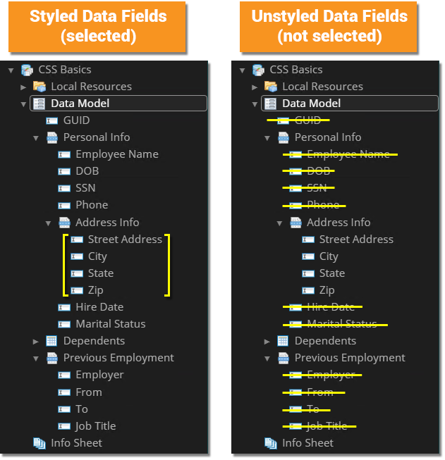
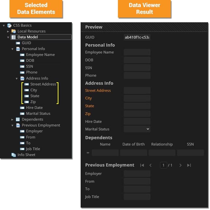
Furthermore, imagine you want to style only Data Fields in a specific Data Section. We can do this with the descendant children (
.Address_Info label This uses the descendant children combinator to select all child Data Field HTML elements nested under the "Address Info" Data Section's HTML element.
|
|
Descendant Children CombinatorSay we want to recolor the labels for Data Fields in the "Address Info" Data Section. We can do that easily with the following CSS rule: .Address_Info label {
color: rgb(248,148,32);
}
The selector
|
|
|
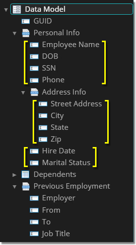
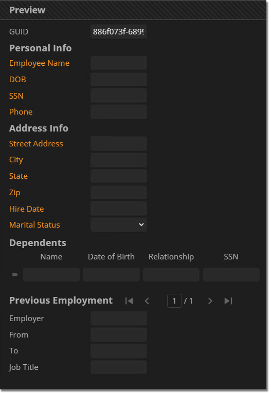
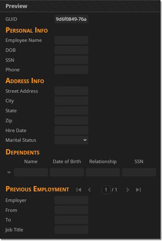
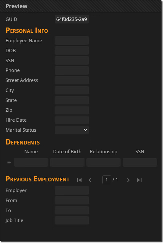
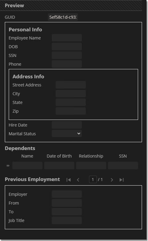
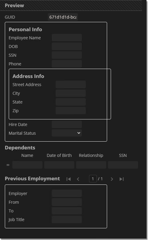
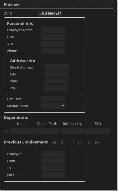
Let's say we want to style all Data Field labels in the "Personal Info" Data Section, including those in its child "Address Info" section.
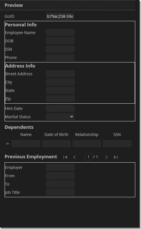
The following rule colors all Data Field labels in the "Personal Info" Data Section orange. .Personal_Info label {
color: rgb(248,148,32);
}
|
| FYI |
Due to how the descendant combinator works, the following selectors will behave identically.
Technically speaking, #2 is more specific.
In this case, the specificity is redundant. #1 functionally does the same thing.
|
Immediate Children Combinator
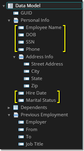
What if this isn't what you want to do? What if you don't want to select all descendant children, but only those that are at the root of an HTML element?
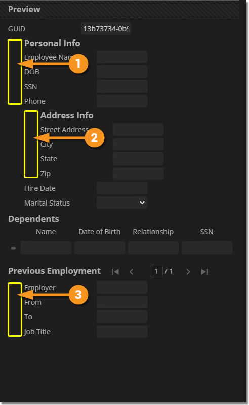
- For example, what if you only want to style Data Field labels at the root of the "Personal Info" Data Section and leave any further descendant labels in the "Address Info" Data Section alone?
- This is what the "immediate children" combinator (
>) is for.
|
|
|||
|
Can we just swap combinators and use and use .Personal_Info > label {
color: rgb(248,148,32);
}
|
|||
|
.Personal_Info > .DataField label {
color: rgb(248,148,32);
}
Then, it will select all
|
| ⚠ |
A Data Section is fundamentally a container for other Data Elements. Thus,
|
Styling Sibling Elements
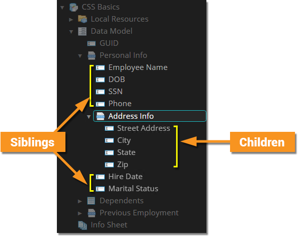
Less commonly, you may want to style sibling elements using the sibling combinators. This is a way of styling sibling Data Elements (existing in the same level of your Data Model's hierarchy) that come after a selected element.
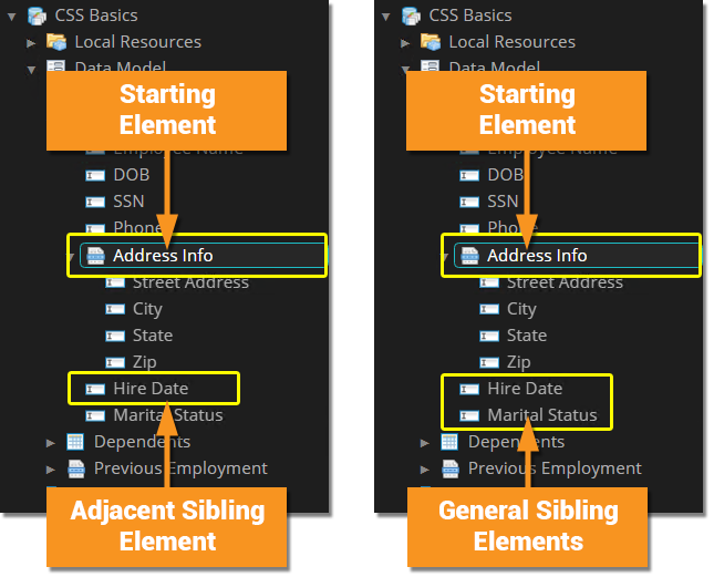
- The
+selects "adjacent" siblings, selecting a single element after a specified element.- Put another way, the first instance of an element after a specific element.
- The
~selects "general" siblings, selecting any and all elements after a specified element.- Put another way, all instances of an element after a specific element.
|
|
|
|
|
|
|
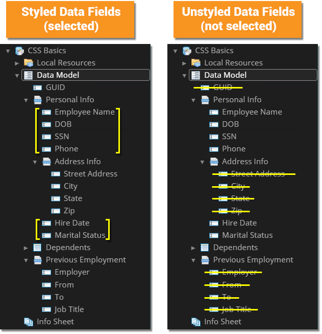
.Address_Info + .DataField label {
color: rgb(248,148,32);
}
|
|
|
.Address_Info ~ .DataField label {
color: rgb(248,148,32);
}
|
Summary
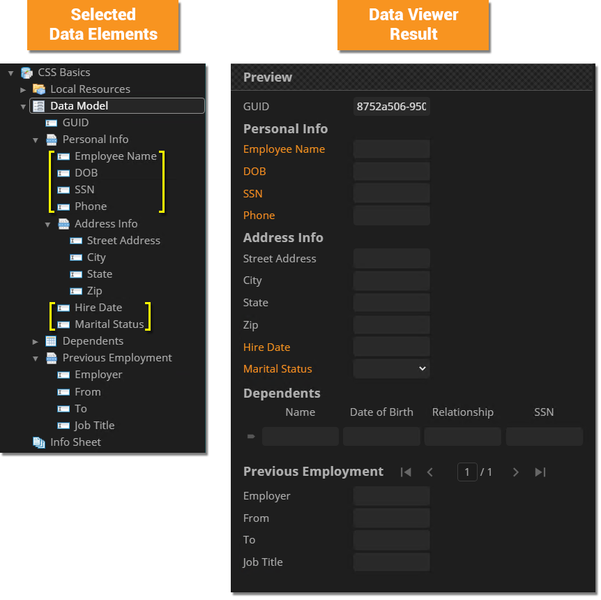
For all cases below, you may presume an additional CSS rule has been added to adjust the label element widths to 140px.
|
Selection Type |
CSS Rule |
Selected Data Elements |
Data View Result |
|
|
label {
color: rgb(248,148,32);
}
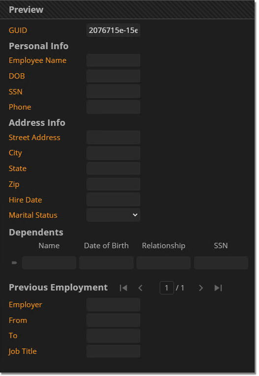
Selects every Data Field's label and colors it orange. |
||
|
|
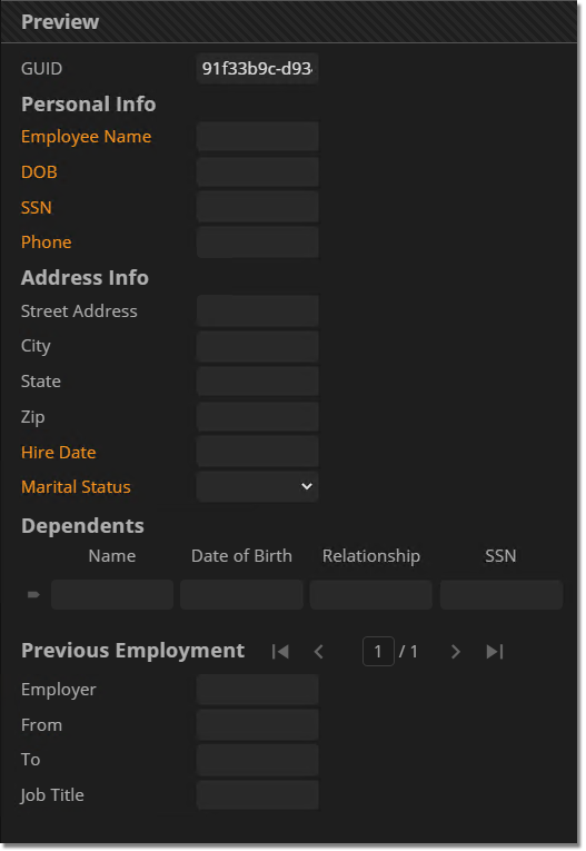
.Employee_Name label {
color: rgb(248,148,32);
}
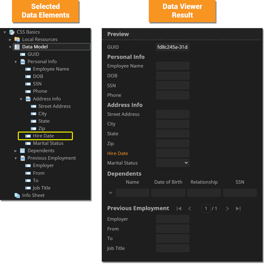
Selects only the "Hire Date" Data Field's label and colors it orange. |
||
|
|
.Personal_Info label {
  color: rgb(248,148,32);
}
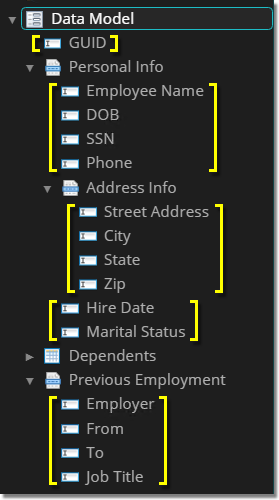
Selects the Data Fields' labels for all children at every descendant level in the "Address Info" Data Section and colors them orange. |
||
|
|
.Personal_Info > .DataField label {
	color: rgb(248,148,32);
}
Selects the Data Fields' labels only for children in the first level in the "Address Info" Data Section and colors them orange. |
||
|
|
.Address_Info + .DataField label {
	color: rgb(248,148,32);
}
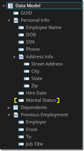
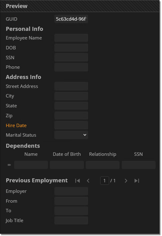
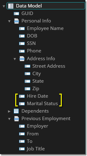
Selects the first sibling Data Field's label after the "Address Info" Data Section and colors it orange.
|
||
|
|
.Address_Info ~ .DataField label {
	color: rgb(248,148,32);
}
Selects all sibling Data Fields' labels after the "Address Info" Data Section and colors them orange.
|
Selector Quick Reference
|
Selector |
Data Element Selection Information |
|
|
Selects Data Fields |
|
|
Selects single-instance Data Sections
|
|
|
Selects multi-instance Data Sections
|
|
|
Selects Data Tables |
|
|
Selects Data Columns
|
|
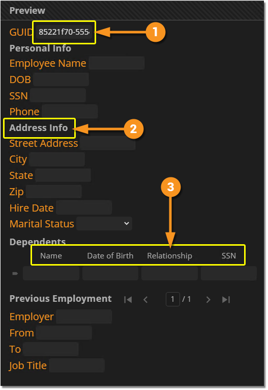
|
The
|
|
|
|
|
|
This is the easiest selector to select Data Column labels.
|
|
|
|
|
|
Textboxes for multiline Data Fields are rendered as a content editable
|
|
|
|
|
|
|
Types of Styling Available
There is A LOT you can do with CSS. There's far too much for us to cover completely. However, there are a few common types of styling you may want to apply to your Data Model.
In this section, we will detail some basic examples as they relate to the following categories:
- Font and Text Styling
- Margins, Borders, Padding, Height and Width Styling
- Color Styling
- Layout Styling
Font and Text Styling
Font and text formatting are some of most basic, but also most important, considerations when building a website. We will review a few of the standard CSS properties that can alter the text labels in a Data Model.
|
|
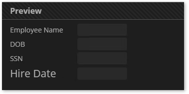
The font-size property will adjust the size (height) of the font. Font size can be adjusted using absolute values or relative values.
|
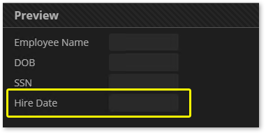
.Hire_Date label {
  font-size: 21px;
}
|
You can also set the font size relatively by setting the font size as a percent or with an "em" value.
- 1em = the current font size. Therefore 0.5em = half the current font size. 2em = double the current font size. And so on.
- Many developers prefer to use relative sizing as it tends to work better across all browsers and consider using em values to be best practice.
The default size of Data Field labels is set to 14px in Grooper. Therefore, the following CSS rules should produce identical results:
.Hire_Date label {
  font-size: 21px;
}
|
.Hire_Date label {
  font-size: 1.5em;
}
|
.Hire_Date label {
  font-size: 150%;
}
|
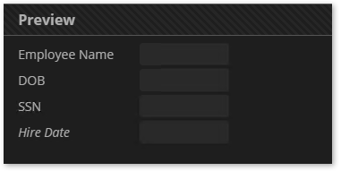
The font-style allows you to italicize text.
|
.Hire_Date label {
  font-style: italic;
}
|
The font-style property may be set to one of the following:
- normal
- italic
- oblique
If no italic or oblique face for the font is available, the browser will attempt to mimic the sloping effect. If italic is selected, but there is no italic face for the selected font, the browser will attempt to use the oblique face before mimicking effect (and visa versa if oblique is selected).
| FYI |
What's the difference between italic and oblique? Good question. The short answer is "not much".
|
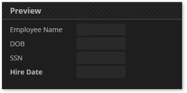
The font-weight property allows you to bolden or lighten text (when available).
|
.Hire_Date label {
  font-weight: bold;
}
|
The font-weight property may be set to one of the following:
- normal
- bold
- bolder
- lighter
If selected and the font being used has a "bold" or "normal" version, the browser will use that. If not, it will attempt to mimic a bold or normal version. The browser will not attempt to mimic a "lighter" or "bolder" version if none are found.
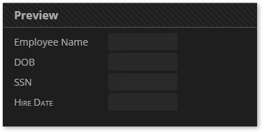
The font-variant property allows you format your text in small caps.
|
.Hire_Date label {
  font-variant: small-caps;
}
|
The font-variant property may be set to either of the following:
- normal
- small-caps
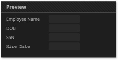
The font-family property sets what font family should be used to render the text.
|
.Hire_Date label {
  font-family: Courier New;
}
|
Be aware a font will only display if it is installed by the browser or on the device viewing the webpage. The following fonts are considered "web-safe". These are fonts universally installed by all browsers.
(Generally) Web-Safe Fonts
- Arial (sans-serif)
- Verdana (sans-serif)
- Tahoma (sans-serif)
- Trebuchet MS (sans-serif)
- Times New Roman (serif)
- Georgia (serif)
- Garamond (serif)
- Courier New (monospace)
- Brush Script MT (cursive)
However, there are no 100% web safe fonts. While these are "universally" installed across "all" browsers, there's always a chance the font is not installed properly or is otherwise missing. That's why it's best practice to use a fallback font.
- Fallback fonts are separated using a comma.
- For example:
font-family: Tahoma, Verdana, sans-serif;- The browser would first attempt to use Tahoma.
- If that font cannot be found, it then attempts to use Veranda.
- If that font cannot be found it will use the generic system sans-serif font for the browser.
AT BARE MINIMUM, you should always include one of the following generic fallback fonts when declaring a font family:
- sans-serif
- serif
- monospace
- cursive
- fantasy
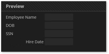
The text-align property allows you to set an alignment for text inside the element.
|
.Hire_Date label {
  text-align: right;
}
|
You may choose one of the following alignments:
- left (This is the default, in most cases)
- right
- center
- justify
As we've seen in previous examples, the color property styles the element's text content's color.
|
.Hire_Date label {
  color: rgb(248,148,32);
}
|
Colors can help draw a user's attention and separate content in meaningful ways. There's also more to coloring a webpage than just coloring text. We'll talk more about color styling in the Color Styling section of this article.
|
Text Style |
CSS Rule |
Selected Data Elements |
Data View Result |
|
|
.Hire_Date label {
  font-size: 21px;
}
Increases the "Hire Date" Data Field's font size to 21 pixels high. |
||
|
|
.Hire_Date label {
  font-style: italic;
}
Italicizes the "Hire Date" Data Field's label. |
||
|
|
.Hire_Date label {
  font-weight: bold;
}
Bolds the "Hire Date" Data Field's label. |
||
|
|
.Hire_Date label {
  font-variant: small-caps;
}
Turns the "Hire Date" Data Field's label to small caps. |
||
|
|
.Hire_Date label {
  font-family: Courier New, monospace;
}
Changes the "Hire Date" Data Field from the default font (Open Sans) to Courier New. If Courier New cannot be rendered, the system monospace font will be used as a fallback font. |
||
|
|
.Hire_Date label {
  text-align: right;
}
Right aligns the "Hire Date" Data Field's text within its |
||
|
|
.Hire_Date label {
  color: rgb(248,148,32);
}
Changes the "Hire Date" Data Field's label's text color to "Grooper orange", using the RGB color value. |
Styling Data Section and Data Table Caption Labels
A Data Section or Data Table's header caption is itself just another child element rendered on a webpage. All Data Section and Data Table HTML elements have a child element with a caption class styling their caption in the Review screen.
When it comes to styling Data Section and Data Table captions, you'll need to use the .caption selector. This will select any element with the caption class.
|
.caption {
  color: rgb(248,148,32);
  font-size: 1.5em;
  font-variant: small-caps;
}
|
|||
|
For example, adding the following CSS rule would remove the caption for the "Address Info" section. .Address_Info .caption {
display: none;
}
|
Margins, Borders, Padding, Height and Width Styling
There's good reason why a div HTML element is named so. A div creates a division within a document, making it more distinct from other elements on the webpage. Margins, borders and padding help make the divisions between HTML elements visually more distinct by increasing the space between the elements (margins), outlining the elements (borders) and increasing the space within an element (padding).
Effective use of margins, borders and padding can increase the readability and accessibility of your Data Model when viewed in a Review viewer.
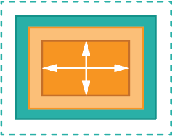
|
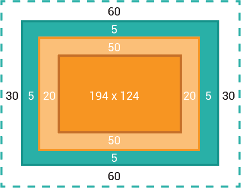
This diagram is designed to help you better understand the different dimensions of an HTML element, including:
|
|||
|
|
|
|
|
|
.DataSection {
  margin-left: 32px;
}
|
| FYI |
Margin specifications are often used to center HTML elements. If you're trying to center an entire element (not the text within an element, but the element itself), try using the following two declarations: margin-left: auto; margin-right: auto; |
|
|
|||
|
.DataTable {
border: 1px solid rgb(255,255,255);
}
The
|
|||
|
.DataSection {
border: 1px solid rgb(255,255,255);
}
Next, we will add some padding to these elements to vastly improve the Data Sections' styling.
|
|
|
|||
|
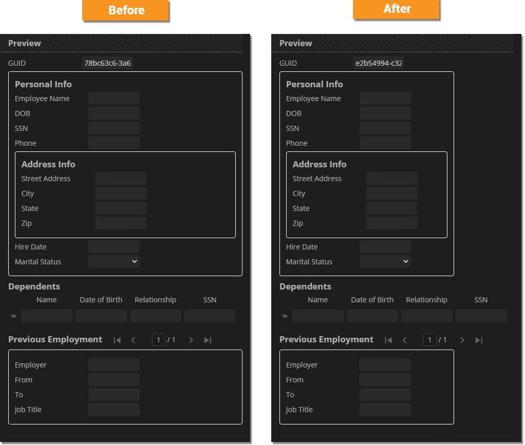
Below, the CSS rule adds a 1 pixel border around Data Sections and increases their padding by 12 pixels on all sides. .DataSection {
border: 1px solid rgb(255,255,255);
padding: 12px;
}
See here, the space between the element and the border are better spaced out. 12 pixels have been added to the top, bottom, left and right edges to the element, between the 1 pixel wide solid border.
|
|||
|
.DataSection {
border: 1px solid rgb(255,255,255);
padding: 12px;
border-radius:4px;
}
|
|||
|
|
|
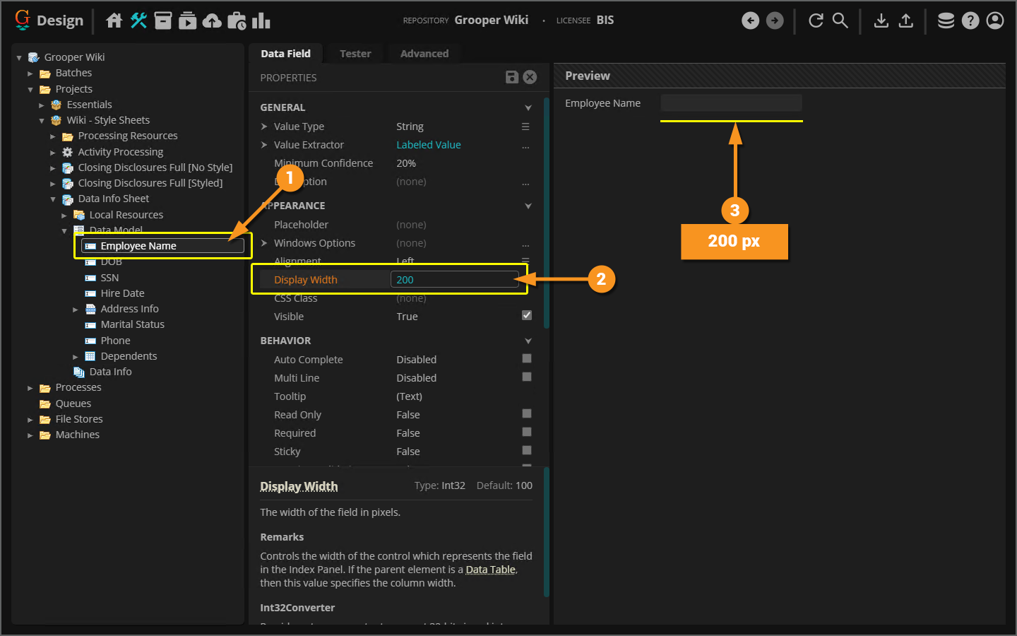
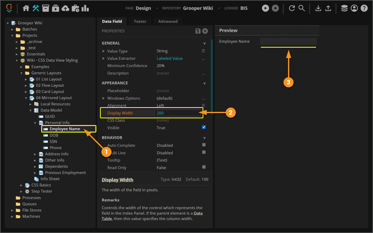
Width and height specifications are often adjusted to better adjust a webpage's layout by adjusting the dimensions of the HTML elements that make up that webpage. For example, commonly Grooper users will adjust the Data Field |
|
|
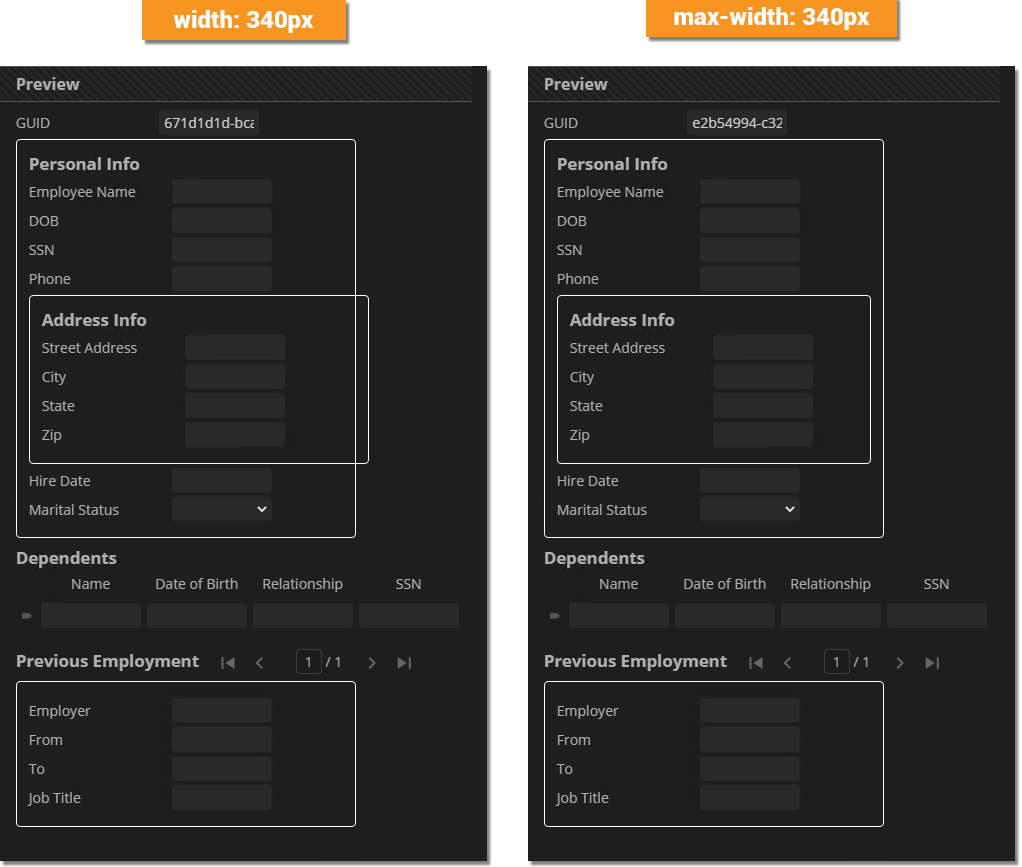
.DataSection {
border: 1px solid rgb(255,255,255);
padding: 12px;
border-radius: 4px;
max-width: 340px;
}
|
|
|
.DataSection {
border: 1px solid rgb(255,255,255);
padding: 12px;
border-radius: 4px;
width: 340px;
}
There are plenty of circumstances in which the literal
|
|
There is one element width you cannot adjust with CSS, an
|
|
Style Description |
CSS Rule |
Selected Data Elements |
Data View Result |
|
|
.DataSection {
margin-left: 32px;
}
Adds 32 pixels to all Data Sections' left margin. Effectively, this left indents all Data Section elements 32 pixels.
|
||
|
|
.DataSection {
border: 1px solid rgb(255,255,255);
}
Outlines all Data Sections with a white 1 pixel wide border. |
||
|
|
.DataSection {
border: 1px solid rgb(255,255,255);
padding: 12px;
}
Outlines all Data Sections with a white 1 pixel wide border. Adds 12 pixels of padding between the element's content and the border. |
||
|
|
.DataSection {
border: 1px solid rgb(255,255,255);
padding: 12px;
border-radius: 4px;
}
Outlines all Data Sections with a 1 pixel wide border. Adds 12 pixels of padding between the element's content and the border. Rounds the corners on the borders. |
||
|
|
.DataSection {
border: 1px solid rgb(255,255,255);
padding: 12px;
border-radius: 4px;
width: 400px;
}
Outlines all Data Sections with a white 1 pixel wide rounded border. Adds 12 pixels of padding between the element's content and the border. Sets the literal width of all Data Section elements to 400 pixels wide. |
||
|
|
.DataSection {
border: 1px solid rgb(255,255,255);
padding: 12px;
border-radius: 4px;
max-width: 400px;
}
Outlines all Data Sections with a white 1 pixel wide rounded border. Adds 12 pixels of padding between the element's content and the border. Sets the maximum width of all Data Section elements to 400 pixels wide. |
Color Styling
Colors are useful in a variety of different ways. They don't just "look pretty". They're used to call attention to different portions of a document, divide sections on a document, or distinguish between portions of a document.
There are a lot of ways you could style elements' colors in HTML (and therefore Data Elements in Grooper's Data Viewer). We're going to focus on the three most common ways colors are styled:
- Text colors
- Border colors
- Background colors
First, how do you pick a color? How do you define whether something is red or blue or hot pink? There are a few different ways to define a color value in CSS.
You can specify colors in CSS in the following ways:
|
#FFF8DC |
Hexadecimal colors
|
|
#FFF8DC50 |
Hexadecimal colors with transparency
|
|
rgb(255, 239, 213) |
RGB colors
|
|
rgba(255, 239, 213, .5) |
RGBA colors
|
|
hsl(36, 100%, 84%) |
HSL colors
|
|
hsla(36, 100%, 84%, .5) |
HSLA colors
|
|
BurlyWood |
Predefined color names used across browsers
|
| FYI |
Which color space should you use? Generally speaking it's up to you. In this article, you will find we most often use the RGB and RGBA color spaces.
|
We've already seen text color styling in this article, using the color property. The color property change the text's color within an element.
|
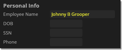
For example, this CSS rule will color the "Employee Name" Data Field's input box text yellow. .Employee_Name input {
color: rgb(255,255,50);
}
Something like this can be useful for a Data Field value that needs highlighting. If a user has a need to keep referencing an extracted value, this will more clearly call it out in the Review viewer. |
You can style a border's color using either the border-color or border property.
|
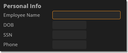
If the HTML element already has a border specification, you can use the This CSS rule recolors the border around the "Employee Name" Data Field's input box. .Employee_Name input {
border-color: rgb(248,148,32);
}
Please note, if the element doesn't already have a border specified (either from an inherited class or in the CSS rule itself), the |
|
|
You can use the The first description line in the following CSS rule creates the border, including coloring it orange with the RGB color .DataSection {
border: 1px solid rgb(248,148,32);
border-radius: 4px;
padding: 12px;
padding-top 8px;
margin-top: 8px;
margin-bottom: 8px;
}
|
Text is considered the "foreground" of an HTML element. Whatever is behind it counts as "background". The background-color property (appropriately enough) colors an element's background. Coloring an element's background can be a great way of drawing attention to certain Data Elements or making visual breaking points between groups of Data Elements.
|
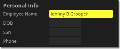
This CSS rule colors the background of the "Employee Name" Data Field's input box yellow. This is another way to make an important field stand out from others. .Employee_Name input {
background-color: rgb(255,255,50);
color: rgb(0,0,0);
}
Notice we also changed the text color to black (
|
|
|
Background color styling is also a way to make your Data Sections distinct.
.DataSection {
background-color: rgba(0,0,0,.25);
border: 1px solid rgba(255,255,255,.5);
border-radius: 4px;
padding: 12px;
padding-top 8px;
margin-top: 8px;
margin-bottom: 8px;
}
The first description ( We're also using RGBA alpha channel here.
|
| FYI |
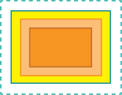
Please be aware any padding in an element is considered part of the element's background. Margins are space outside the element and are not part of the element's background.
|
Layout Styling
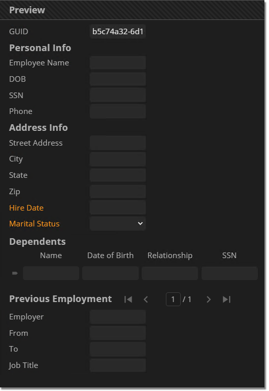
Without CSS, you'd have no control over how Data Elements are laid out in the Data Viewer. They would appear on the screen essentially as a list, with each Data Field occupying a single line. However, CSS rules give you a great deal of flexibility in terms of laying out the various elements that make up the Data Elements in your Data Model.
With a few simple adjustments to properties like margins, borders, and an element's display mode, you can re-order your Data Model's layout to make a better review experience.
Generic Layouts
| FYI |
The Content Model and Data Model used to demonstrate these layouts can be found in the Grooper importable ZIP file found in the About section of this article. |
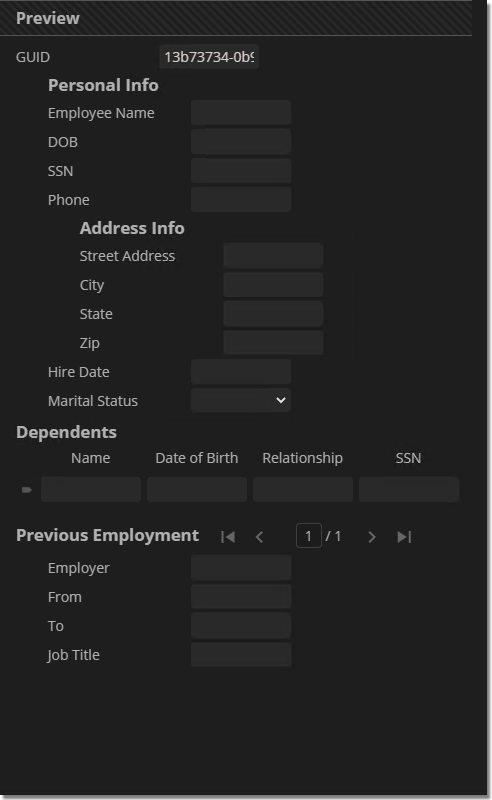
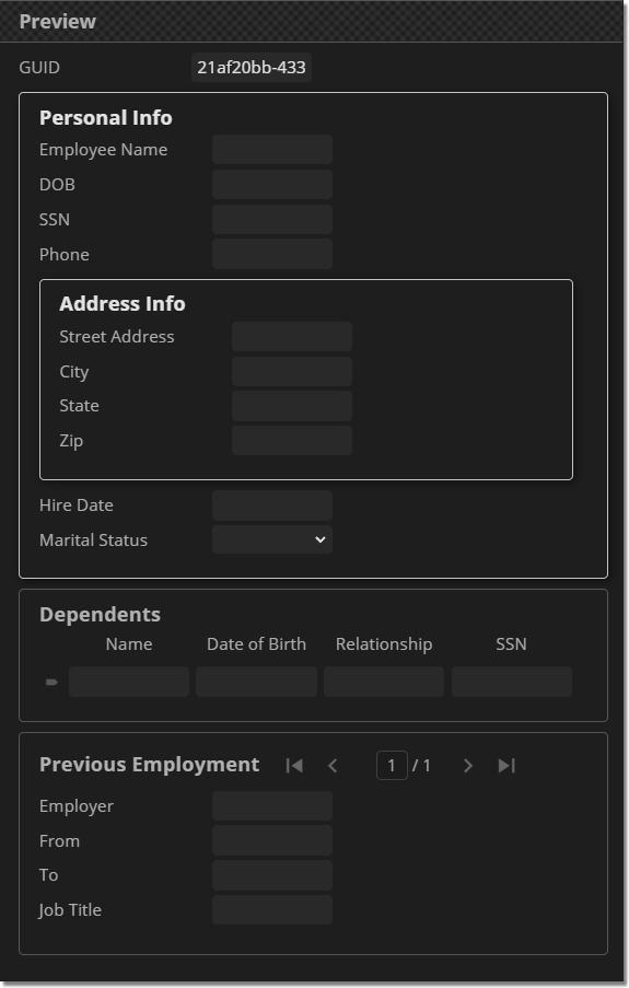
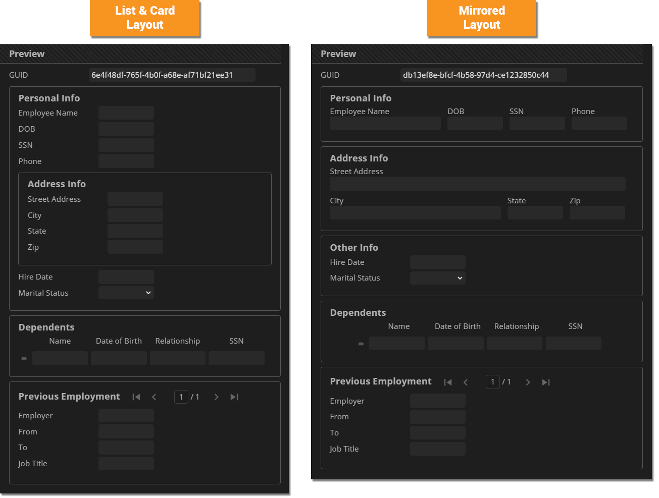
The List Layout styles fields as a simple list. This type of layout will often use margins and horizontal widths to better space out a list of fields and sections of fields. Left margins are often employed to indent Data Sections to make them more visually distinct from fields at the root of the Data Model and other sections of fields.
Below is an example of a generic List Layout style sheet.
|
CSS |
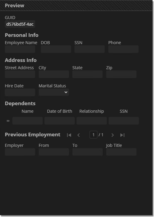
"Info Sheet" Dummy Document Example |
Sample Invoice Model Example |
label {
width: 140px;
}
.DataSection .DataField,
.DataSection .DataSection,
.DataTable table {
margin-left: 32px;
}
.DataSection,
.DataTable,
.DataGridCollection {
margin-top: 8px;
margin-bottom: 8px;
}
|
The Flow Layout stacks labels on top of their input boxes and lists them horizontally, wrapping fields to the next line when reaching the end of the screen (or containing HTML element). This layout can pack several fields into a relatively small space, conserving screen real estate. Label widths are typically less important to specify uses this layout. Instead Data Field horizontal margins and input widths are utilized to space out fields.
Below is a generic Flow Layout style sheet.
|
CSS |
"Info Sheet" Dummy Document Example |
Sample Invoice Model Example |
.DataField {
display: inline-flex;
flex-direction: column;
}
.DataSection,
.DataTable,
.DataGridCollection {
margin-top: 8px;
margin-bottom: 8px;
}
|
The Card Layout relies heavily on Data Sections and borders to create distinct divisions between different kinds of fields on the document. Each section (or card) in the Card Layout will generally implore either a List Layout or Flow Layout within the boundaries of the card itself.
Below is a generic Card Layout style sheet.
- This style sheet also uses the
hoverandfocus-withinpseudo-classes to lighten the borders around the card upon hovering your cursor and clicking inside the Data Section (focusing within it). - The
focus-withinpseudo-class was also used to add a drop shadow behind selected Data Sections and Data Tables.- More information on pseudo-classes can be found at w3Schools.
- No background color was added to each card/section. However, that is often included in this style approach.
- Because the fields in each card (i.e. the Data Fields in each Data Section) have a List Layout, you could call this a "List & Card Layout"
- However, you could easily use a "Flow Layout" approach instead to create a "Flow & Card Layout". Simply remove the
labelrule and replace it with one that makesDataFieldelements some kind of inline element (such as thedisplay: inline-flex; flex-direction: columndeclaration in the previous tab)
- However, you could easily use a "Flow Layout" approach instead to create a "Flow & Card Layout". Simply remove the
|
CSS |
"Info Sheet" Dummy Document Example |
Sample Invoice Model Example |
label{
width: 140px;
}
.DataSection,
.DataGridCollection,
.DataTable {
border: 1px solid rgba(255,255,255,.25);
padding: 16px;
padding-top: 8px;
border-radius: 4px;
margin-top: 8px;
margin-bottom: 8px;
margin-right: 12px;
}
.DataGridCollection .DataSection {
border: none;
padding: 0px;
}
.DataSection:hover,
.DataTable:hover,
.DataGridCollection:hover {
border-color: rgba(255,255,255,.5);
}
.DataSection:focus-within,
.DataTable:focus-within,
.DataGridCollection:focus-within {
border-color: rgba(255,255,255,.75);
box-shadow: 2px 2px 8px rgb(0,0,0,.5)
}
.DataGridCollection .DataSection:focus-within {
box-shadow:none;
}
|
Mirrored Layout
|
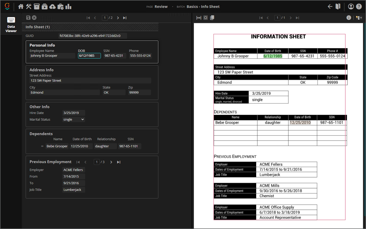
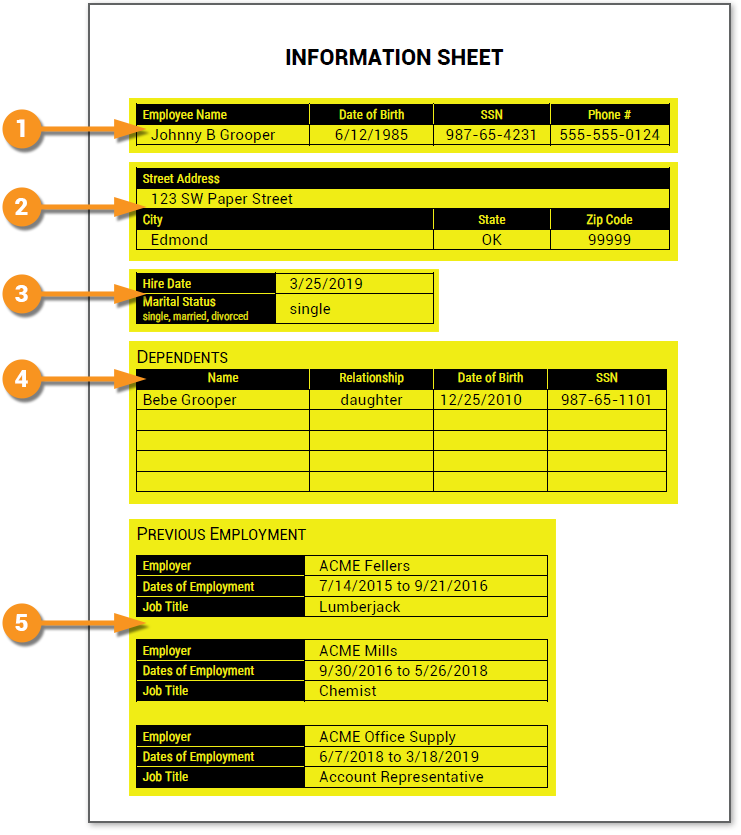
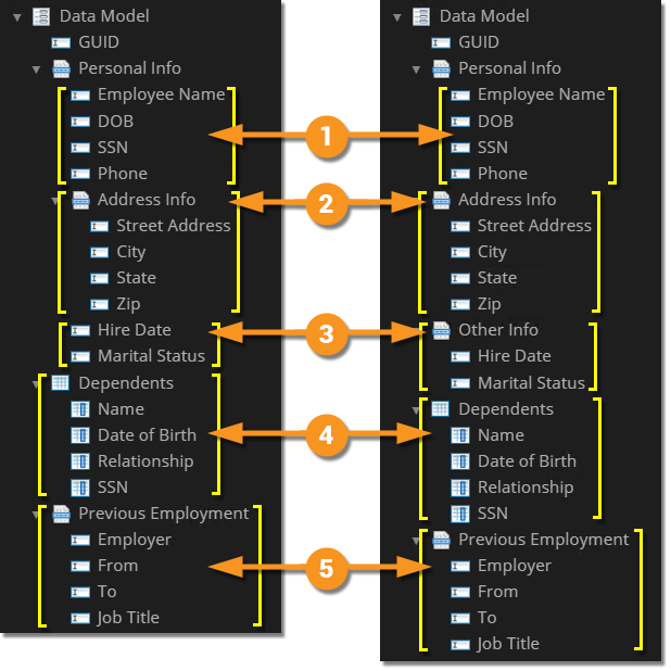
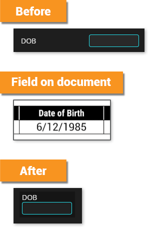
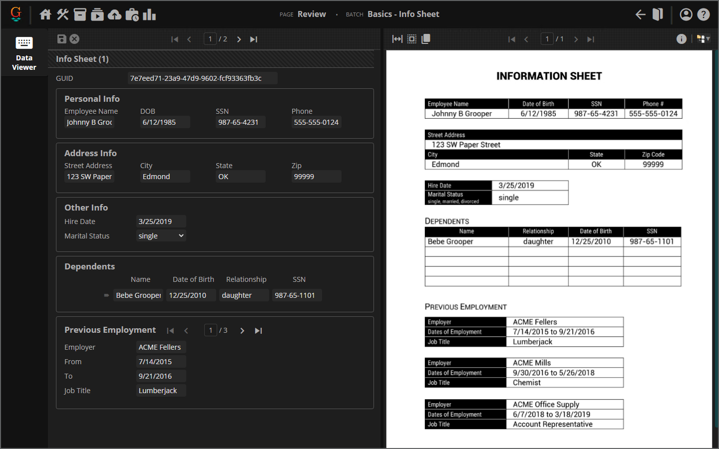
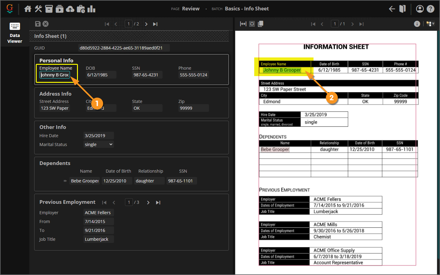
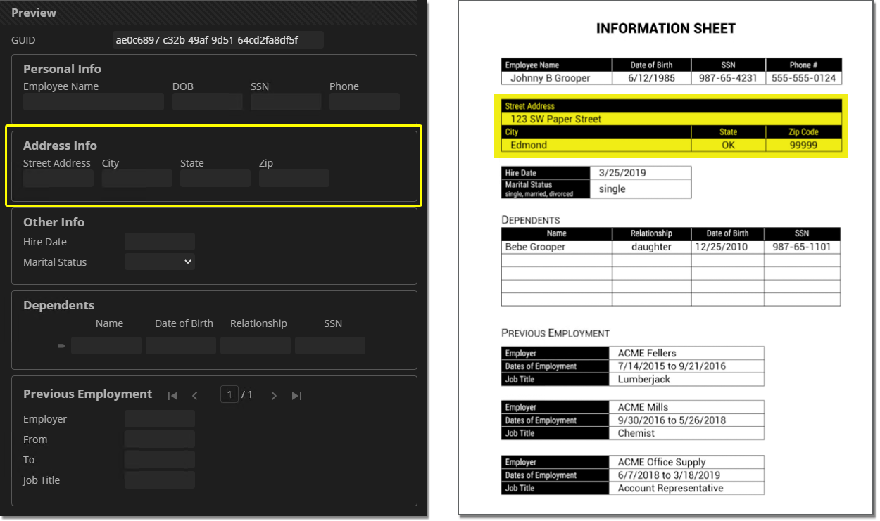
Using Data Sections to better group and organize sections of Data Fields and CSS rules to style those Data Sections and Fields, you can get pretty close to the same layout in the Data Viewer screen in Review as you have on the page. This can be a tremendous boon to document reviewers. If the entry fields are laid out like are on the actual document, they don't have to do nearly as much searching for what they're trying to enter. Ultimately, this saves time on data entry and can reduce error rates as well.
|
|
|
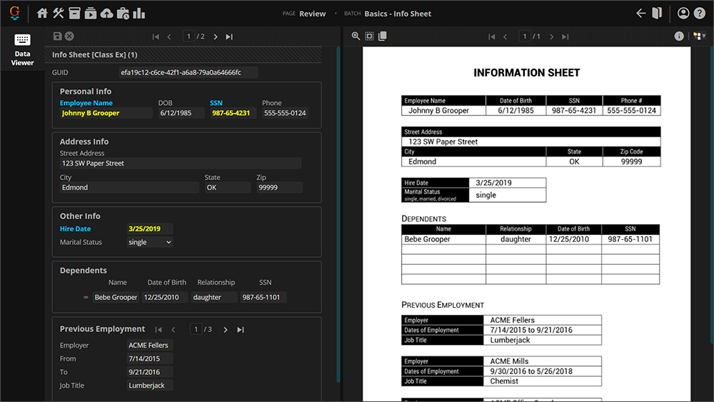
As you can see from the "List & Card Layout" image, some styling has already been done to this Data Model. The Data Field label widths are increased, and the Data Sections and Data Table have some border and background color styling.
|
anchor text"
Before even touching CSS, you should think about organizing your Data Model to better lay out Data Elements in the Review Viewer. Data Sections can be extraordinarily beneficial to this end.
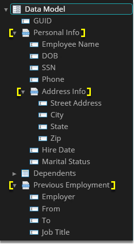
A Data Section can act as a simple bucket to hold other Data Elements to better organize your Data Model. They will also act as a parent HTML element holding the Data Elements. You can use CSS to style Data Sections in the following ways to mirror a document's layout:
- To physically constrain the Data Section's child elements in the browser, separating sets of Data Fields from others.
- To order fields within a Data Section, laying them out vertically or horizontally next to each other.
- To order Data Sections themselves, laying them out vertically or horizontally next to each other.
- To use children selectors to style just the elements within a specific Data Section, distinct from the typical styling for the rest of the Data Model and other Data Sections.
|
Just looking at the document, you should mentally break up collections of elements base on how they are grouped on the page and similarities in layout. These mental divisions of fields will be candidates for their own Data Sections in our Data Model.
|
|||
|
|
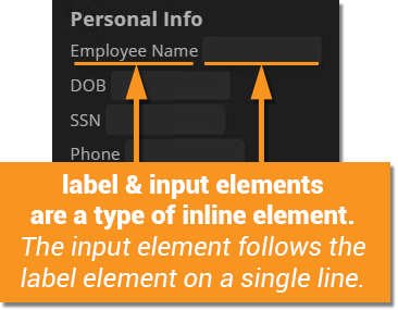
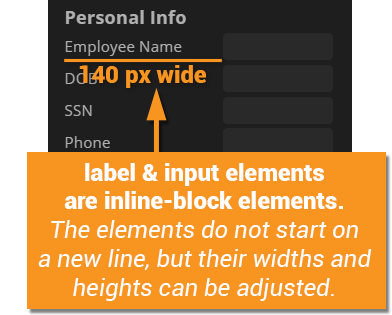
To understand how HTML elements are laid out on a webpage, you need to have a concept of "inline" and "block" elements (as well as a special type of inline element called "inline-block").
|
Block elements always start on a new line.
|
|||
|
Inline elements do not start on a new line.
|
|||
|
Specifically, Inline-block elements do not start on a new line, but you can adjust the width and height of the element.
|
|||
|
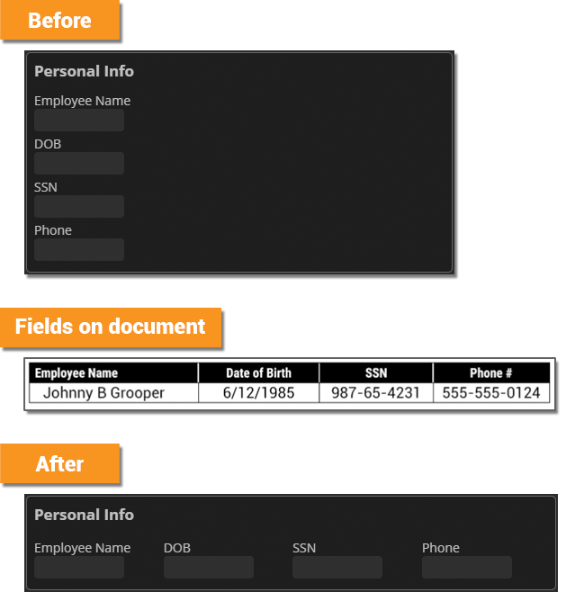
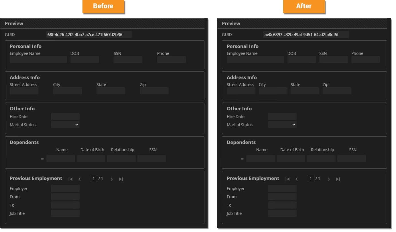
Getting our Data Model to look more like the document's layout has a lot to do with manipulating the inline and block modes using the On our document, several of the fields' labels are stacked vertically on top of the value. We can replicate this layout by simply changing our Data Fields'
.DataField * {
display: block;
}
|
|||
|
On the document, fields are laid out horizontally next to each other, rather than being stacked vertically on top of each other. Because Data Fields are block elements by default, our Data Fields have more of a vertical layout. To get a more of a horizontal layout, we can simply change their display mode to inline-block. This will allow multiple Data Fields to be displayed across a single line. Adding the rule below will accomplish this goal: .DataField {
display: inline-block;
}
|
|||
|
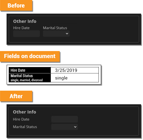
What about this section of fields on the document? Their layout is different from the rest of the document. The layout is actually more like the default Data Field styling. What can we do to fix this? |
|||
|
Adding, the following CSS rules will suffice: .Other_Info .DataField {
display: block;
}
.Other_Info .DataField * {
display: inline-block;
}
|
|||
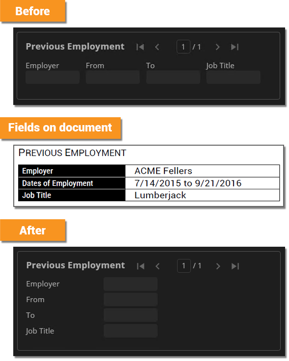
|
.Other_Info .DataField,
.Previous_Employment .DataField {
display: block;
}
.Other_Info .DataField *,
.Previous_Employment .DataField * {
display: inline-block;
}
|
|||
|
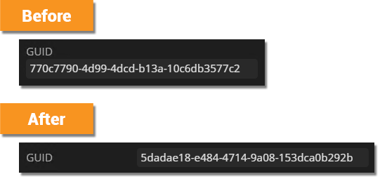
Lastly, we need to evaluate our "GUID" Data Field. This Data Field is not actually found on the document, but generated with a Default Value expression. So its layout is really up to you.
However, if you wanted to more broadly style any Data Field at the root of the Data Model and only Data Fields at the root of the Data Model, you could use the following selector:
| |||
|
.Other_Info .DataField,
.Previous_Employment .DataField,
.DataModel > .DataField {
display: block;
}
.Other_Info .DataField *,
.Previous_Employment .DataField *,
.DataModel > .DataField * {
display: inline-block;
}
|
|||
|
|
|||
| FYI |
We did two things to make our Data Model more closely mirror the document's layout:
.DataField * {
display: block;
}
.DataField {
display: inline-block;
}
.DataField {
display: inline-flex;
flex-direction: column;
}
|
Styling your Data Elements dimensions can be an effective way to help your Data Model mirror your document's layout. Sometimes this boils down to nothing more than adjusting the width of your Data Field's input elements.
|
|
|
|
|
|
|
It doesn't really make sense for all our Data Fields' labels to be a set width now that most of them have a different layout orientation.
|
|
|
label{
width: 140px;
}
In reality, the only .Other_Info label,
.Previous_Employment label,
.DataModel > .DataField label {
width: 140px;
}
|
|
|
|
|
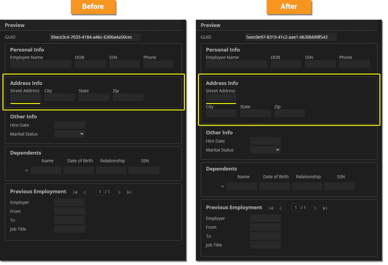
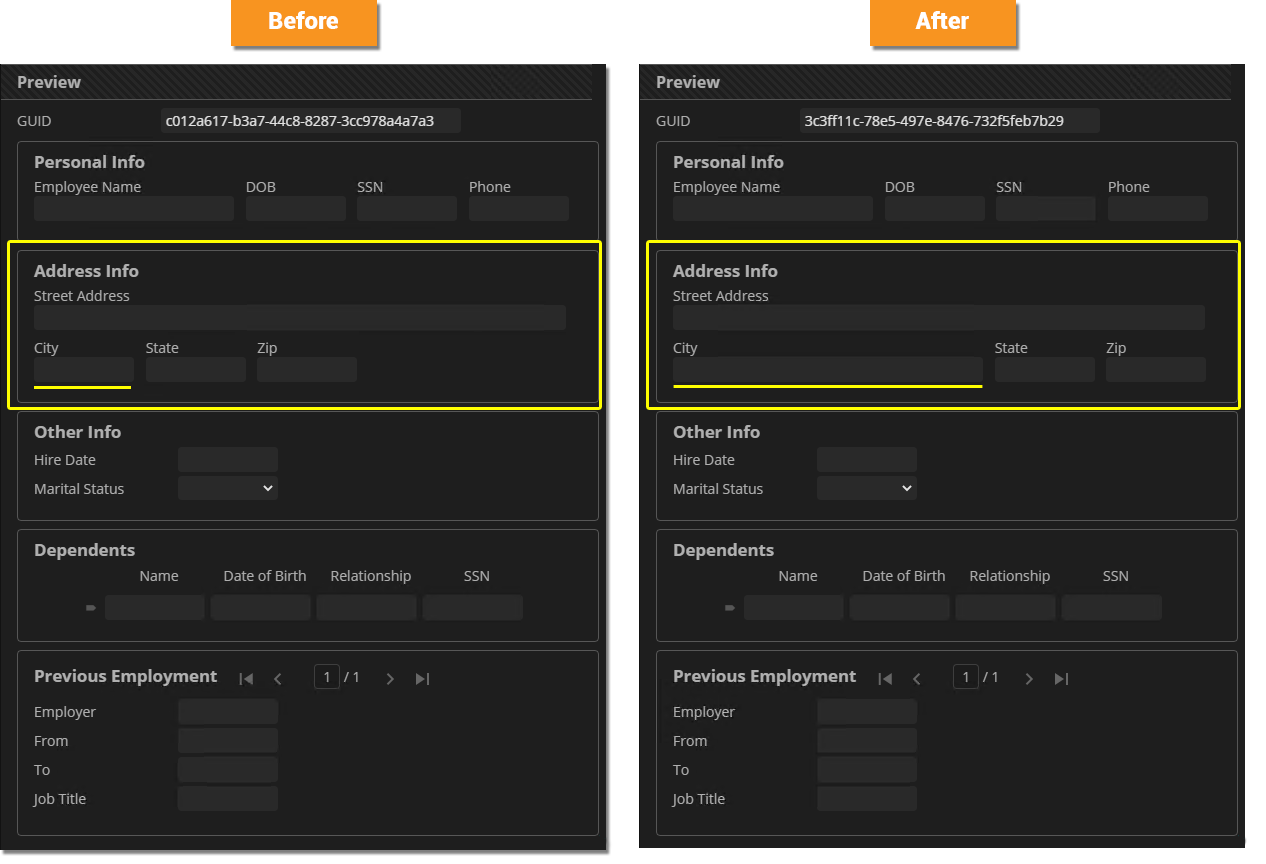
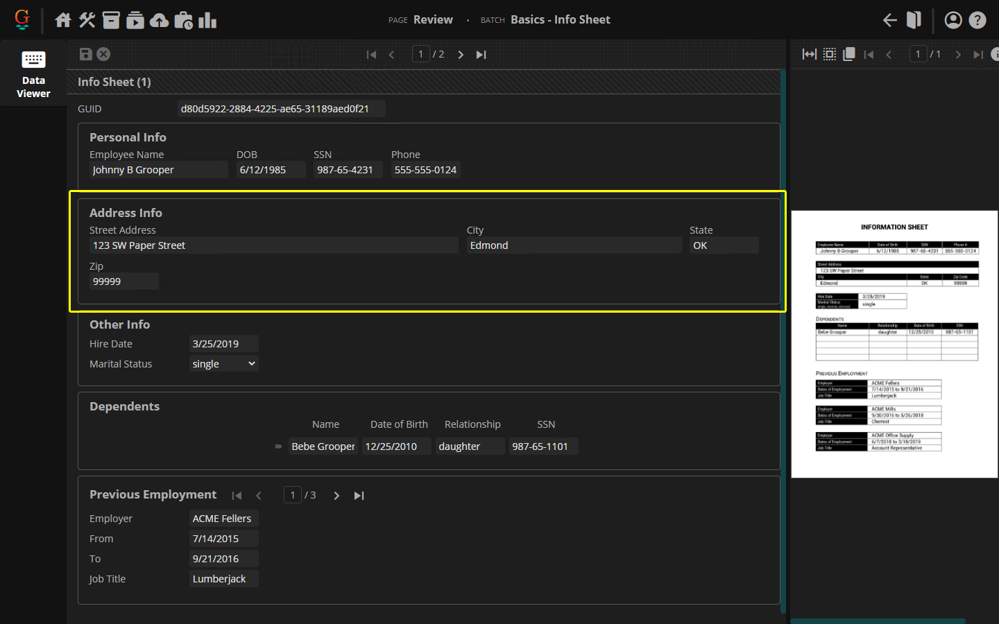
Option 1: Change "Street Address" to a Block Element This may well be the simplest solution simply because the "Street Address" field is a single field that occupies the entire width of the document. What is a block element? It's an HTML element that occupies the entire width of whatever element its contained in. If the width of the document is analogous to the width of the Review screen, it sure seems like the "Street Address" field would be a good candidate for a block element. All we need to do is add a CSS rule for the "Street Address" field, changing its .Street_Address {
display: block;
}
Because "Street Address" is now a block element, it now takes up a whole line by itself. This is much more in line with what the document looks like. |
|
|
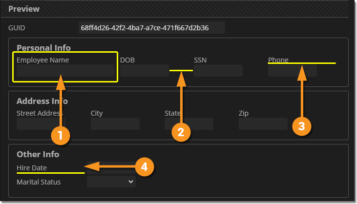
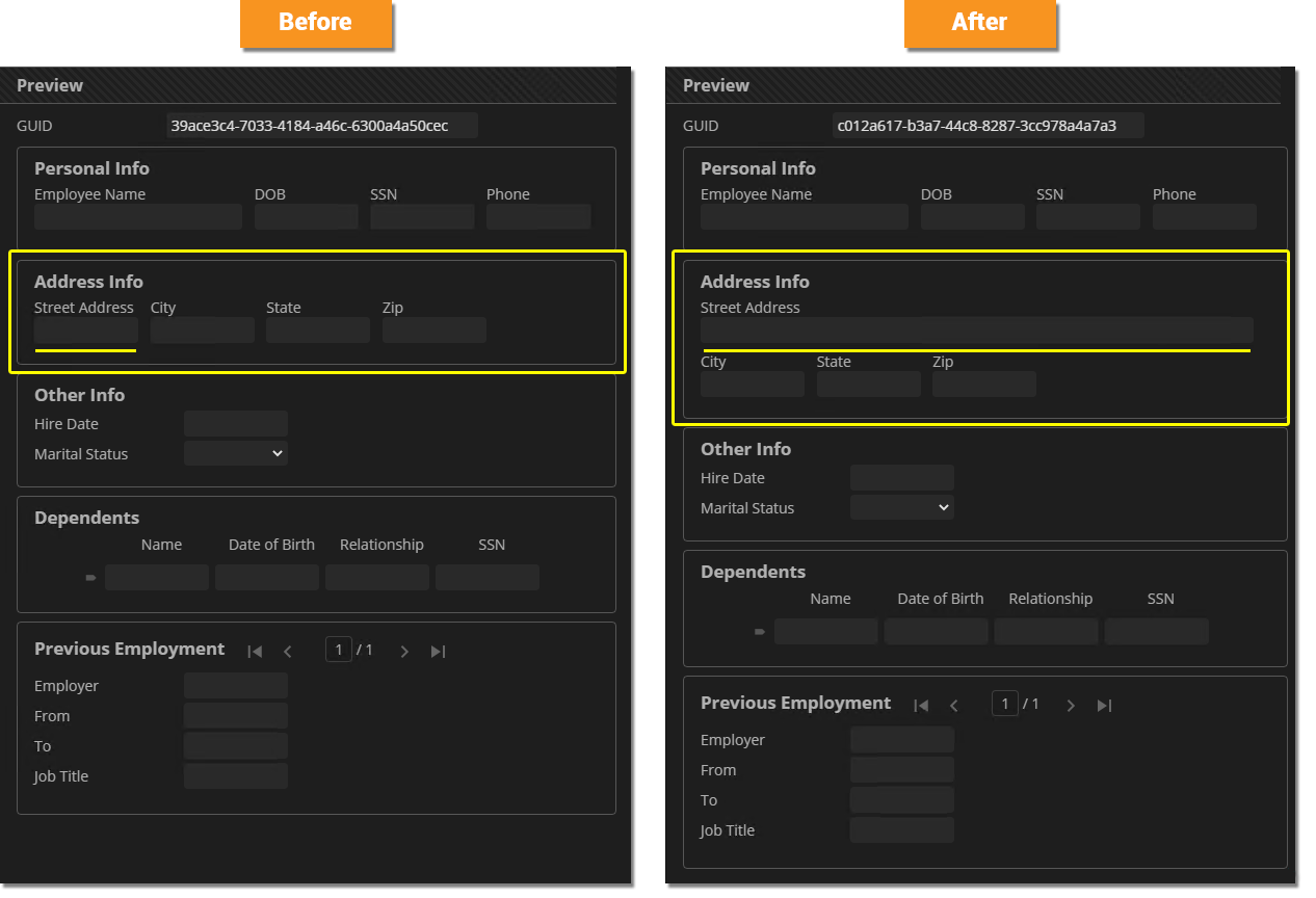
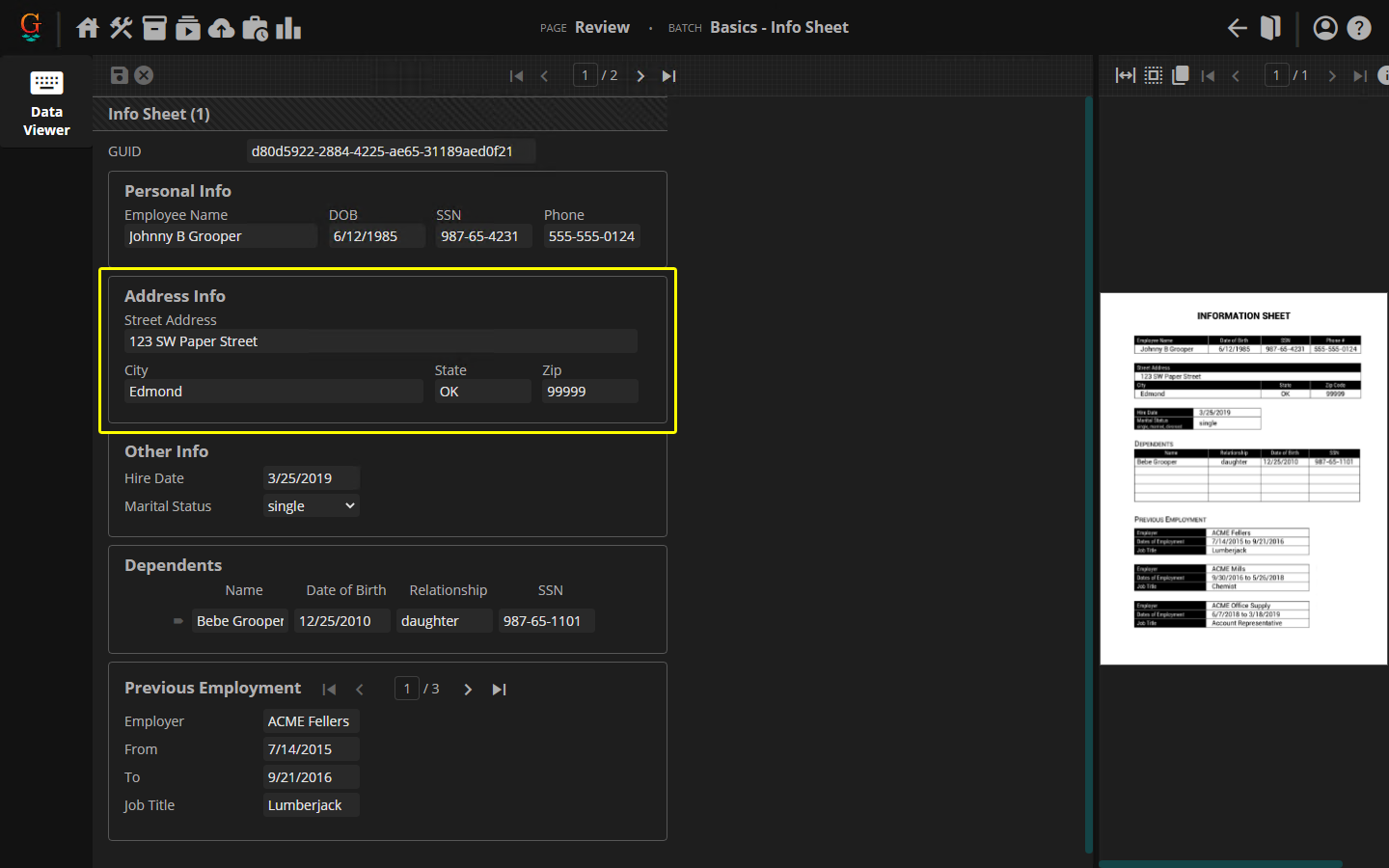
Option 2: Adjust Input Widths and Let Elements Wrap Lines Another option is to rely on line wrapping to get you what you want. There's only so much screen real estate for the Data Viewer to occupy. You can control how elements wrap to subsequent lines but adjusting their widths. We can adjust the width of one or more Data Field's
|
|
|
There are a few plus sides to this approach:
| |
|
|
|
|
|
|
|
.DataSection {
max-width: 580px;
}
Now our wrapping works as expected, regardless of the width of the Data Model panel and our Data Model's layout nearly perfectly mirror's the document's layout. |
|
Below you will find the end-result CSS style sheet for our "Mirrored Layout" Data Model styling. You can copy and paste this text into the Style Sheet property of any Data Model.
- After reading this article, can you figure out what each of these rules is doing?
/*Rules adjusting Data Fields from a List Layout to a Flow Layout*/
.DataField {
display: inline-block;
}
.DataField * {
display: block;
}
/*Data Section and Data Table border styling*/
.DataSection,
.DataGridCollection,
.DataTable {
border: 1px solid rgba(255,255,255,.25);
padding: 16px;
padding-top: 8px;
border-radius: 4px;
margin-top: 8px;
margin-bottom: 8px;
}
.DataGridCollection .DataSection {
border: none;
padding: 0px;
}
/*Adjusts the width of Data Tables to extend to the maximum width of the Data Model.*/
.DataTable {
width: auto;
}
/*Effectively centers a Data Table's table content (every child HTML element except the Data Table's caption*/
.DataTable > *:not(.caption) {
margin-left: auto;
margin-right: auto;
}
/*Adjusts maximum width of Data Sections to wrap Data Fields appropriately*/
.DataSection {
max-width: 580px;
}
/*Adjusts layout for the Other Info and Previous Employment sections and Data Fields at the root of the Data Model*/
.Other_Info .DataField,
.Previous_Employment .DataField,
.DataModel > .DataField {
  display: block;
}

.Other_Info .DataField *,
.Previous_Employment .DataField *,
.DataModel > .DataField * {
  display: inline-block;
}
.Other_Info label,
.Previous_Employment label,
.DataModel > .DataField label {
  width: 140px;
}
/*Hover and focus pseudo elements. Changes border and drop shadow styling when hovering over and selecting Data Sections*/*/
.DataSection:hover,
.DataTable:hover,
.DataGridCollection:hover {
border-color: rgba(255,255,255,.5);
}
.DataSection:focus-within,
.DataTable:focus-within,
.DataGridCollection:focus-within {
border-color: rgba(255,255,255,.75);
box-shadow: 1px 1px 12px rgb(0,0,0,.5), -1px 0px 8px rgb(0,0,0.5);
}
.DataGridCollection .DataSection:focus-within {
box-shadow:none;
}
Tips and Best Practices
Two Approaches: Global Element Styling VS Local Element Styling
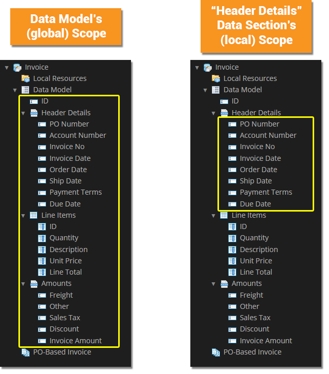
Be aware you can style a Data Model in two ways:
- Globally - By editing the Data Model's Style Sheet.
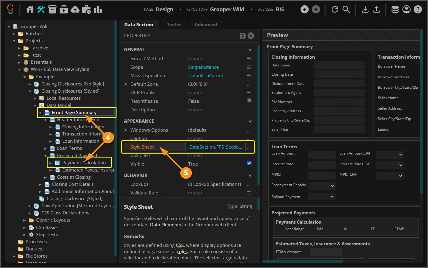
- Locally - By editing any children Data Sections' or Data Tables' Style Sheets.
- Styling a Data Section or Data Table's Style Sheet directly, simply limits the scope of accessible elements.
Put another way, when you configure a Data Section or Data Table's Style Sheet, their name is prepended to the selectors you enter behind the scenes.
|
So, why do one or the other? Let's look at the pros and cons.
|
| ||||||||||||
Styling Flat Data Models VS Hierarchical Data Models
|
Generally speaking, there are two types of Data Models:
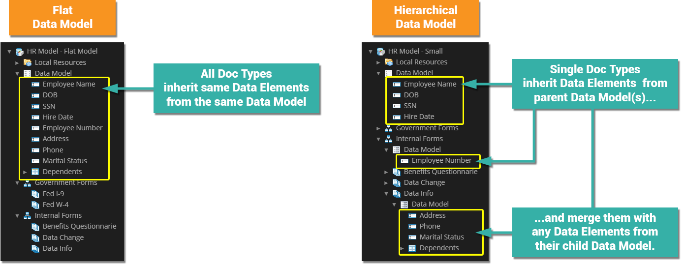
|
Thus far in this article, we've focused on flat Data Models to keep things simpler. Once you start working with more hierarchical models, you need to be careful about where you're editing the CSS style sheet. Each Data Model in the hierarchy has a Style Sheet property. Much like the Data Elements from each Data Model are ultimately merged to form a Document Type's Data Model the CSS rules from each style sheet is merged into a single one as well.
There may be some confusion when multiple Data Models attempt to style a specific property for an element using different values. You need to keep in mind two things:
- The most specific selector will always be applied.
- If the Content Model's Data Model CSS has a more specific selector, its rule will be applied.
- On the other hand, if the Document Type's Data Model CSS has a more specific selector, its rule will be applied.
- In cases where the specificity is ambiguous, the lowest level Data Model's style sheet will be applied.
- In other words, A Document Type's Data Model is more specific than a Content Model's Data Model. Therefore, the Document Type's CSS rule would win out.
Creating and Using CSS Classes
Classes in CSS are a great way of tagging certain kinds of HTML elements for styling. For example, classes are how we distinguish between the HTML elements representing Data Fields and Data Sections. They're both div elements, but Data Fields are div elements with a DataField class where Data Sections have a DataSection class.
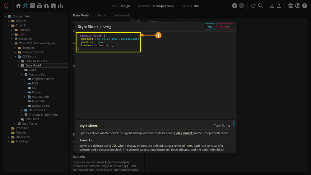
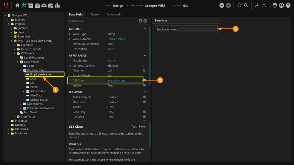
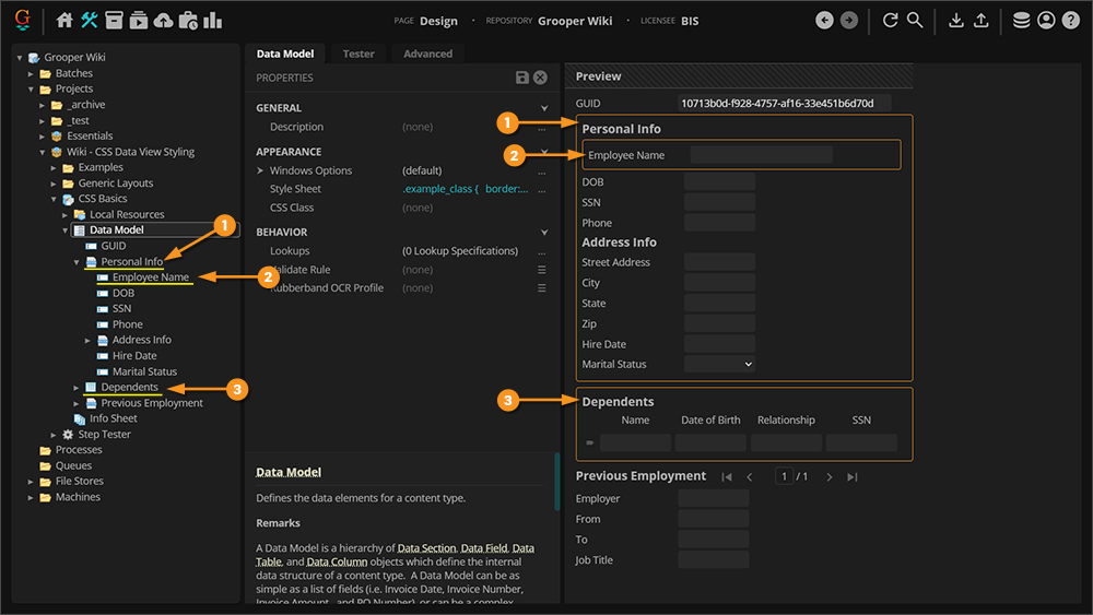
You can also create your custom CSS classes and assign them to any Data Element (Data Fields, Data Sections, Data Tables and Data Columns) using their CSS Class property.
|
.example_class {
	border: 1px solid rgb(248,148,32);
	padding: 8px;
	border-radius: 4px;
}
|
|||
|
|
|||
|
|
Example Classes
Highlight Class
|
This class was designed to quickly highlight certain fields. It turns a Data Field's label blue and its input text bold yellow.
.highlight label {
	color: DeepSkyBlue;
	font-weight: bold;
}
.highlight input {
	color: Yellow;
	font-weight: bold;
}
Note we needed two CSS rules to accomplish this, both declaring the |
Blur Class
|
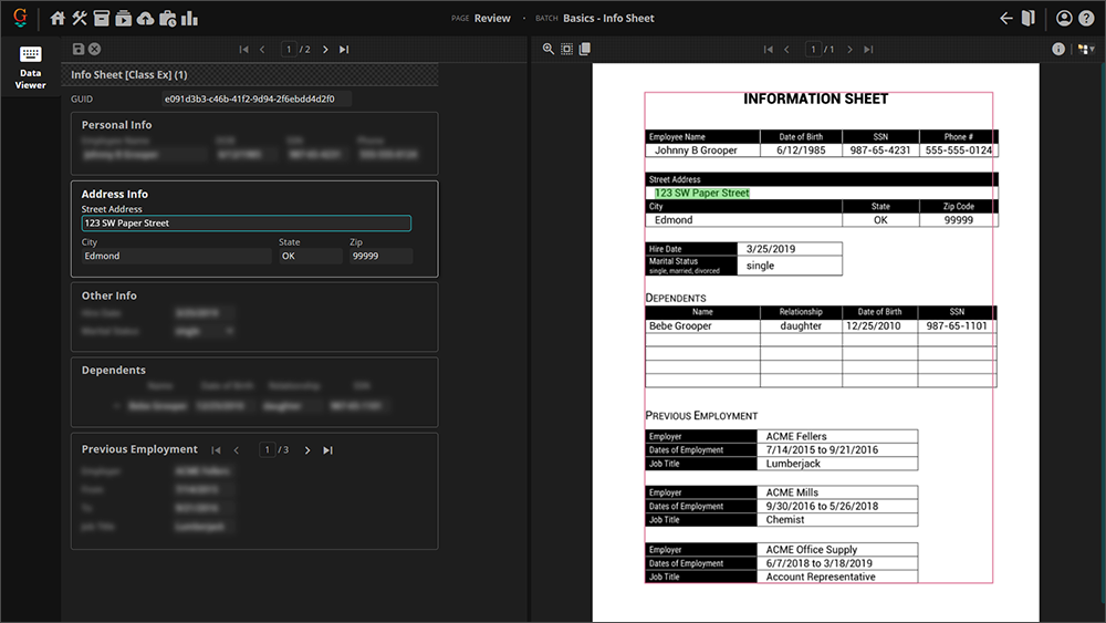
What it does is simple. When assigned to a Data Section or Data Table's CSS Class property, it blurs everything except the Data Section or Data Table's caption if the user is not focused inside the section or table. Effectively, all fields will be blurred out except those in the section you're actively editing.
.blur:not(:focus-within) > *:not(.caption) {
  filter: blur(4px);
}
|
Examples
In this section, we will post various Data Model Style Sheet examples. Use them to get ideas for what you may be able to incorporate into your own Data Models.
Comments are included in some of these style sheets to document various CSS rules. See below for an example of a comment.
/*This is a comment*/
Editor's Note: Consider all the following CSS examples a "work in progress". These styles have not been extensively tested using real-world Content Models.
Generic Examples
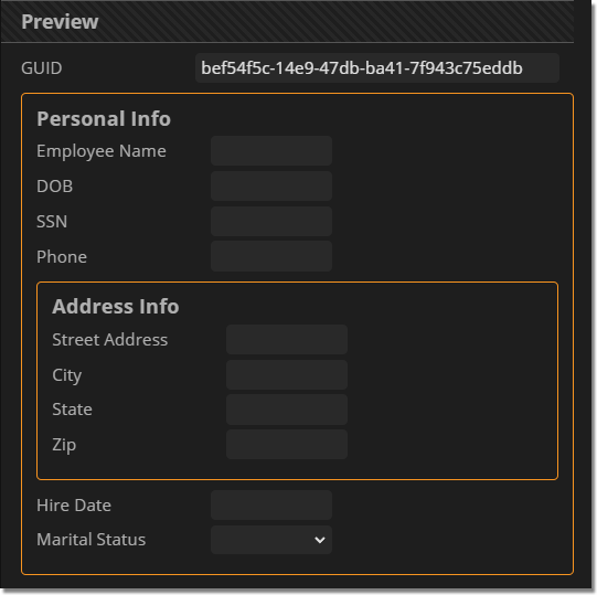
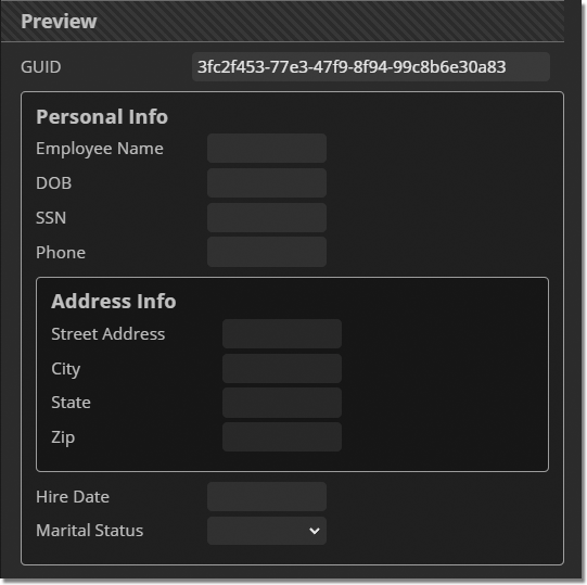
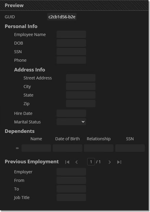
If you have not seen them already, click the link below to check out the Generic Layouts section of this article. If you're looking for simple, generic types of layout styles you will find some there.
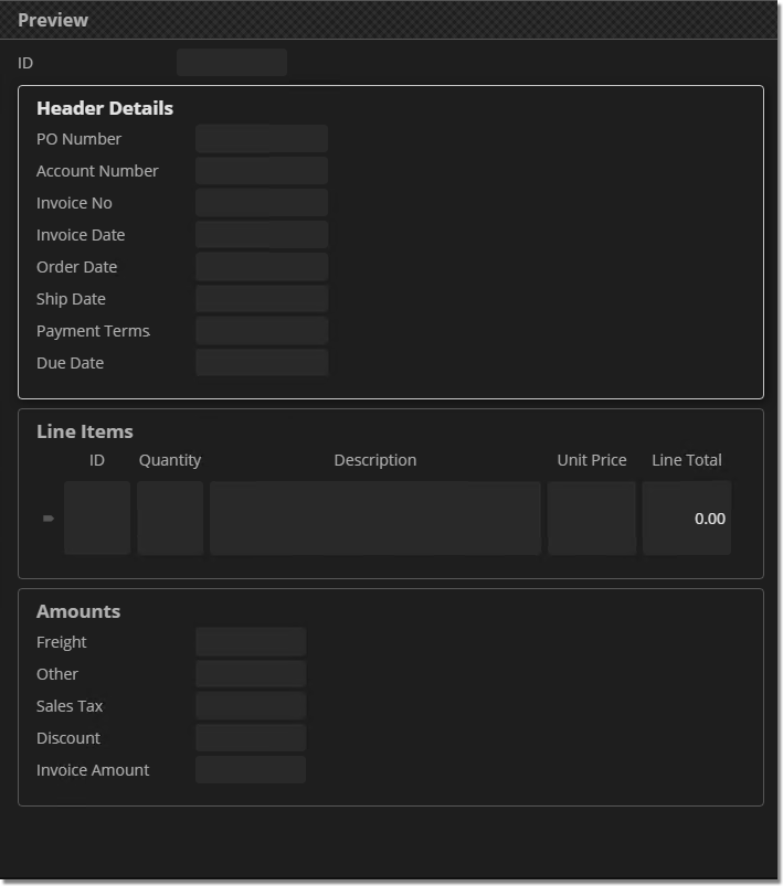
Simple Invoice Model Examples
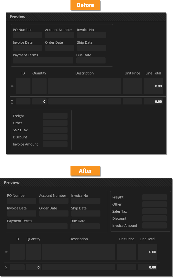
These are a couple different Style Sheet examples for a PO-based invoice model.
For a lot of document cases, you can't perfectly mirror a document's layout because you are processing a lot of different versions of the same kind of document.
Invoices are a good example of this. While you're always collecting (roughly) the same data from invoices (invoice number, invoice date, balance due, etc.), each different vendor is going to have a different format.
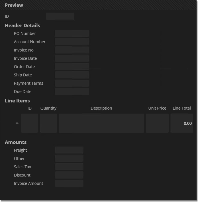
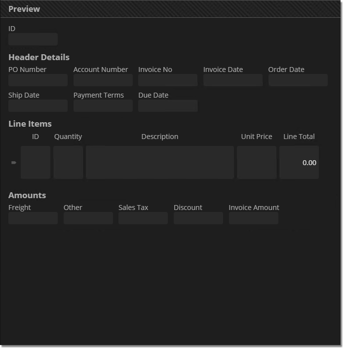
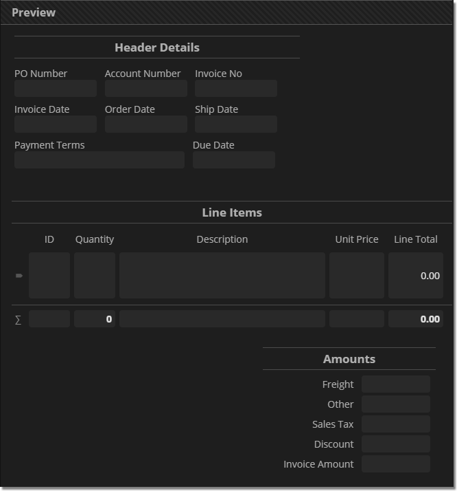
- This Style Sheet attempts a "mixed layout" approach where the "Header Details" Data Section uses the "Flow Layout" and the "Amounts" Data Section uses a "List Layout".
- This mixed approach styles the model to look at least more like an invoice than a flat list of fields.
- This Style Sheet also styles the Data Section and Data Table captions differently (just for fun).
|
Full CSS |
Data Model Preview |
/*Generic Data Model styling*/

.DataSection {
  vertical-align: top;
  margin: 4px;
  height: 224px;
}

.DataField label {
  width: 120px;
}

.caption {
  text-align: center;
  border: solid rgba(255, 255, 255, .2);
  border-width: 1px 0px;
  margin-top: 16px;
  margin-bottom: 8px;
  padding: 4px 0px;
}

/*Header Details Data Section styling*/

.Header_Details {
  max-width: 416px;
  width: fit-content;
}

  .Header_Details .DataField {
    display: inline-flex;
    flex-direction: column;
  }

/*Amounts Data Section styling*/

.Amounts {
  max-width: 252px;
  text-align: right;
  margin-left: auto;
  margin-right: 24px;
}

  .Amounts .DataField label {
    margin-right: 8px;
  }
|
This Style Sheet renders Data Sections as inline-block elements.
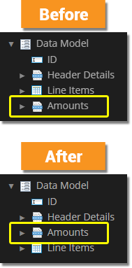
- See the difference in the two Data Model preview images where the "Amounts" Data Section is moved to come before the "Line Items" Data Table'.
- This Style Sheet also removes all Data Section and Data Table captions to give you a look at what that looks like.
|
Full CSS |
Data Element Order |
Data Model Preview |
/*Generic Data Model styling*/

.DataField label {
  width: 120px;
}

.caption {
  display: none;
}

.DataSection {
  border: 1px solid rgba(255,255,255,.1);
  border-radius: 5px;
  padding: 8px;
  display: inline-block;
  vertical-align: top;
  margin: 4px;
  max-height: 216px;
}

/*Header Details Data Section Styling*/

.Header_Details {
  max-width: 420px;
  width: fit-content;
}

  .Header_Details .DataField {
    display: inline-flex;
    flex-direction: column;
}
|
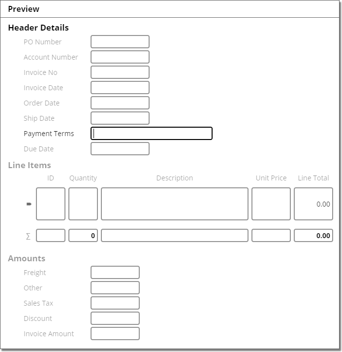
This Style Sheet attempts to completely invert the default color-scheme, going from a dark mode theme to a light mode one. Please note, this is the work of a CSS novice and may not be perfect, but should give you some ideas about how you can play around with color styling.
| FYI |
Some of the CSS rules below use the
This style sheet also uses CSS variables to define color values reused throughout the CSS.
|
|
Full CSS |
Data Model Preview |
/*Variables*/

.DataModel {
  --focus-black: rgb(0,0,0);
  --unfocus-grey: rgba(0,0,0,.5);
  --hover-blue: rgba(0,0,255,.5);
}

/*Generic Data Model List Layout styling*/

.DataField label {
  width: 132px;
}

.DataSection > .DataField,
.DataSection > .DataGridCollection,
.DataSection > .DataTable,
.DataSection > .DataSection {
  margin-left: 32px;
}

.DataTable > *:not(.caption) {
  margin-left: 32px;
}

/*Color Styling. Note: "Invoice" is the name of the Content Model.*/

.Invoice {
  background-color: rgb(255,255,255);
  height: 100%;
}

.title-bar [title] {
  color: rgb(0,0,0);
}

  /*Caption Coloring*/

  .caption {
    color: var(--unfocus-grey)
  }

    /*Data Section Caption Colors*/
    .DataSection:focus-within h2.caption {
      color: var(--focus-black);
    }

    .DataSection:focus-within .DataSection h2.caption {
      color: var(--unfocus-grey);
    }

    .DataSection .DataSection:focus-within > h2.caption {
      color: var(--focus-black);
    }

    /*Multi Instance Data Section Caption Colors*/
    .DataGridCollection:focus-within .caption {
      color: var(--focus-black);
    }

    .DataGridCollection:focus-within .DataGridCollection .caption {
      color: var(--unfocus-grey);
    }

    /*There might be a simpler way to do this rule.  It accommodates a rare case where you have a parent multi-instance Data Section, a child single-instance Data Section and grandchild multi-instance Data Section.  It styles the grandchild multi-instance Data Section's caption upon focus.*/
    .DataGridCollection .DataSection .DataGridCollection:focus-within .caption {
      color: var(--focus-black);
    }

    /*Data Table Caption Colors*/
    .DataTable:focus-within div.caption {
      color: var(--focus-black);
    }

    /*Data Field and Data Column label colors*/
    .DataField label {
      color: var(--unfocus-grey);
    }

    .DataField:focus-within label {
      color: var(--focus-black);
    }

    th.DataColumn {
      color: var(--unfocus-grey);
    }

    th.DataColumn.focused {
      color: var(--focus-black);
    }

    /*Data Field and Data Column input colors. ".DataValue" is used in place of "input" to accomodate both single line and multiline fields/table cells.*/
    .DataField .DataValue,
    .DataColumn .DataValue {
      color: var(--focus-black);
      border-color: var(--unfocus-grey);
      border-width: 2px;
    }

    .DataField:focus-within .DataValue,
    .DataColumn:focus-within .DataValue, {
      color: var(--focus-black);
      border-color: var(--focus-black);
      border-width: 2px;
    }

    .DataField:hover .DataValue,
    .DataColumn:hover .DataValue {
      border-color: var(--hover-blue);
      border-width: 2px;
    }
|
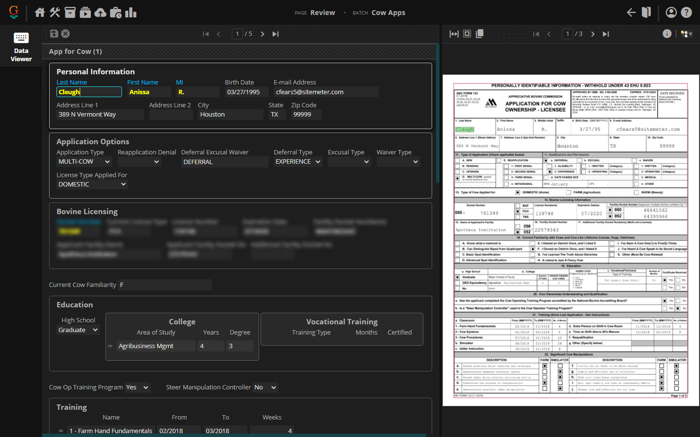
Another Mirrored Layout Example
|
This is another example of a "mirrored layout" styled Data Model. It aims to more closely mirror the layout of the Application For Cow Ownership document, which is a much more data dense document than our example in the Layout Styling section of this article. /*Establishes "highlight" CSS class*/
.highlight input {
color: Yellow;
font-weight: bold;
}
.highlight label {
color: DeepSkyBlue;
}
/*Establishes the "blur" CSS class*/
.blur:not(:focus-within) > *:not(.caption) {
filter: blur(4px);
}
/*Establishes basic styling for Data Sections and Data Tables*/
.DataSection,
.DataTable,
.DataGridCollection {
max-width: 876px;
border: 1px solid rgba(255,255,255,0.25);
border-radius: 5px;
margin-top: 8px;
margin-bottom: 8px;
padding: 16px;
padding-top: 8px;
}
/*Colors borders around Data Sections and Data Tables when hovering your cursor over
them (soft white) and entering fields (bright white).*/
.DataSection:hover,
.DataTable:hover,
.DataGridCollection:hover {
border-color: rgba(255,255,255,.5);
}
.DataSection:focus-within,
.DataTable:focus-within,
.DataGridCollection:focus-within {
border-color: rgba(255,255,255,.75);
box-shadow: 1px 1px 12px rgb(0,0,0,.5), -1px 0px 8px rgb(0,0,0.5);
}
.DataGridCollection .DataSection:focus-within {
box-shadow: none;
}
/*Purely aesthetic rule to extend the background of a Data Table to the width of the
widest Data Section*/
.DataTable {
width: auto;
}
/*Establishes styling ONLY for Data Fields at the first level of the Data Model's
hierarchy (That is to say any Data Field NOT in a Data Section).*/
.DataModel > .DataField {
display: inline-block;
margin-right: 32px;
margin-top: 16px;
}
/*Aligns Data Field labels vertically on top of their input boxes for any Data Field in
a Data Section and the "Comments" Data Field.*/
.DataSection .DataField,
.Comments {
display: inline-flex;
flex-direction: column;
}
/*Styles the Education section and its elements. Mostly, syling is done to produce two
inline Data Tables inline beside the single Data Field in the section.*/
/*.Education {
white-space: nowrap;
}*/
.Education .DataTable {
display: inline-table;
padding-left: 0px;
padding-right: 0px;
background-color: rgba(255,255,255,0.05);
}
.Education .DataTable .caption {
text-align: center;
}
.Education .DataField {
text-align: center;
margin-top: 16px;
}
/*Styles Data Fields in the Signatures Data Section*/
.Signatures .DataField {
display: grid;
grid-template-columns: 250px auto;
}
.Signatures .Approval_Signature,
.Signatures .Signature_Date {
display: inline-grid;
}
|


