Design Page: Difference between revisions
Dgreenwood (talk | contribs) |
Dgreenwood (talk | contribs) |
||
| Line 40: | Line 40: | ||
:* {{IconName|account_circle}} '''User Info''' - Displays user and Grooper version information. You can also switch between dark and light mode here. | :* {{IconName|account_circle}} '''User Info''' - Displays user and Grooper version information. You can also switch between dark and light mode here. | ||
:* {{IconName|help}} '''Help''' - Opens the Grooper in-app Help page. | :* {{IconName|help}} '''Help''' - Opens the Grooper in-app Help page. | ||
<br clear=all> | |||
== Navigating the Node Tree == | == Navigating the Node Tree == | ||
Revision as of 11:50, 29 August 2025

The Grooper UI is divided up into "pages" accessible from the Home page of your Grooper install and from the links in the "Context Toolbar" at the top of the page.
The Design page is the primary user interface for Grooper configuration. It is the central workplace for Grooper designers and administrators. From the Design page, users create, test and administer nodes in a Grooper Repository.
Design page layout
The Design page has three major components:

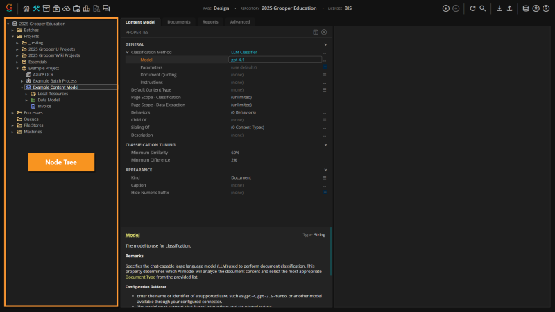
- The Node Tree
- This is a Tree Viewer that shows the Grooper Repository's full node hierarchy. Nodes are the main configuration objects in Grooper. They are the building blocks of a Grooper Repository. These are the package_2 Projects, stacks Content Models, settings Batch Processes and other nodes that are created and implemented in a Grooper document processing solution.
- Nodes are configured by editing their properties in their Property Grids.
- Nodes are arranged in a parent-child hierarchy. Nodes can be expanded to show and select their children.
- Nodes can have a complex relationship with other nodes in a Grooper Repository. Almost all node types (package_2 Projects, stacks Content Models, settings Batch Processes, etc.) make reference to other nodes when configuring their properties. Node relationships are also determined by their parent-child hierarchy (Example: A Data Model defines what data is extracted from a document. The Data Model's Data Field children define what individual fields are extracted).

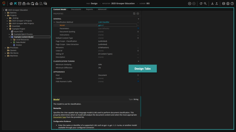
- Design Tabs
- Each node has one or more Design tabs. As nodes are selected in the Node Tree, these tabs appear in the "Design Tabs" panel. Each tab serves a different purpose.
- Every node has a "General" tab where the node's Property Grid appears. This is where Design users configure settings. This tab is always named after the selected node's type ("Project", "Content Model", "Batch Process", etc.)
- Many node types have "Tester" tabs. These allow users to select a inventory_2 Batch in a "Test Source" panel, test the nodes configuration and view results in a Document Viewer.
- Some node types have highly specialized tabs to further configure, test, and manage the selected node.
- All nodes have an "Advanced" tab. This tab is intended for users who need to perform in-depth configuration, troubleshooting, or maintenance tasks beyond standard property editing. This tab has these components:
- Node Information Panel - Displays advanced node properties and metadata in a property grid, allowing for direct editing of certain fields.
- File List - Shows all files attached to the node, with options to open, download, or delete files.
- Inbound References - Lists all nodes that reference the current node, providing insight into dependencies and relationships.
- Outbound References - Lists all nodes referenced by the current node, helping users understand the node's connections within the repository.
- Toolbar Actions - Includes buttons for unlocking the node, saving or discarding changes, managing files, and reassigning references.

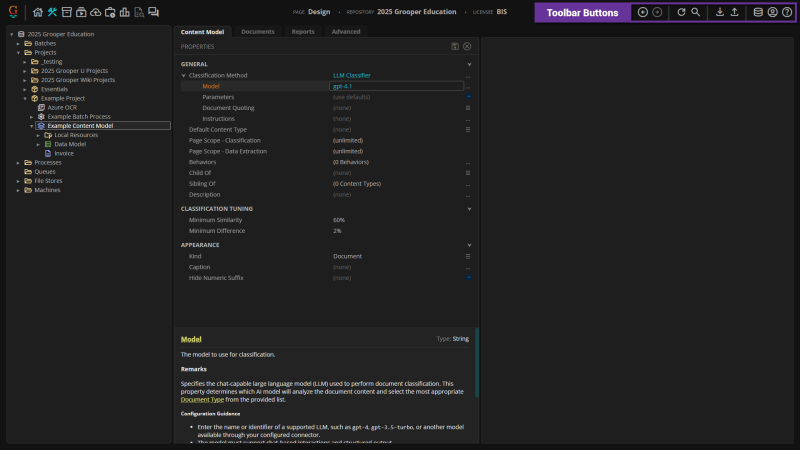
- Toolbar Buttons
- There are several buttons in the Context Toolbar for the buttons. These include:
- arrow_circle_left Back - Go back to the previously selected node in the Node Tree.
- arrow_circle_right Forward - Go forward to the next selected node in the Node Tree.
- refresh Refresh Node - Refresh the tree structure in the Node Tree. This also clears the program cache for the selected node and its children.
- search Search Tree - Searches for nodes in the Node Tree. This will only search for children of the selected node.
- download Download ZIP - Downloads the selected node (and its children) as a Grooper ZIP file. Used to export and archive Grooper nodes. See Download and Upload Grooper Nodes for more information.
- upload Upload ZIP - Upload a Grooper ZIP Upload to import items into the selected node. See Download and Upload Grooper Nodes for more information.
- database Change Repository - Connect to a different Grooper Repository.
- account_circle User Info - Displays user and Grooper version information. You can also switch between dark and light mode here.
- help Help - Opens the Grooper in-app Help page.
